Embracing the Boldest Color in the Spectrum
Between the cheerful brightness of yellow and the intense passion of red lies orange—a color that radiates warmth, energy, and creativity. It is arguably one of the most vibrant and striking colors in the visible spectrum. Yet, despite its beauty, it is often the most misunderstood color in interior design. Many homeowners shy away from orange, fearing it will look too aggressive, too “fast-food,” or simply too difficult to style.
However, when handled correctly, orange is a powerhouse. It can transform a sterile room into a cozy sanctuary or turn a boring corner into a dynamic focal point. The secret lies not in the color itself, but in the company it keeps. Not many people know exactly what colors match with orange because it is so dominant. Therefore, you must be careful and strategic.
If you are looking to refresh your living space, understanding how to balance this citrus hue is essential. Do not let your house have a color palette that clashes or induces headaches. Instead, learn to harness the energy of orange to create a home that is sophisticated, inviting, and uniquely yours. Below is a comprehensive deep dive into color theory and the seven best color combinations to elevate your home decor.
Let’s Know More About Color Theory
Before you can confidently choose which colors match with orange, you simply must understand the fundamentals of color theory. Color theory is not just for artists; it is the roadmap that tells you why certain pairings sing while others scream. It provides the scientific and artistic justification for harmonious and matching color combinations.
The Color Wheel: Your Best Friend
To understand color theory, visualizers use the color wheel. This tool maps the relationship between primary, secondary, and tertiary colors.
- Complementary Colors: These are colors that sit directly opposite each other on the wheel. For orange, the direct opposite is blue. When placed together, they create the highest possible contrast, making both colors appear brighter.
- Analogous Colors: These are colors that sit next to each other. For orange, these are red and yellow. These combinations are low-contrast and create a serene, harmonious flow.
- Triadic Colors: If you want to map three or four colors that match orange, you can draw a triangle or square on the wheel to find colors with equal distance. For a triadic scheme, orange pairs with purple and green.
Understanding Nuance: Hue, Tint, and Shade
When we say “orange,” we rarely mean the color of a safety cone. In home decor, “orange” encompasses a vast spectrum:
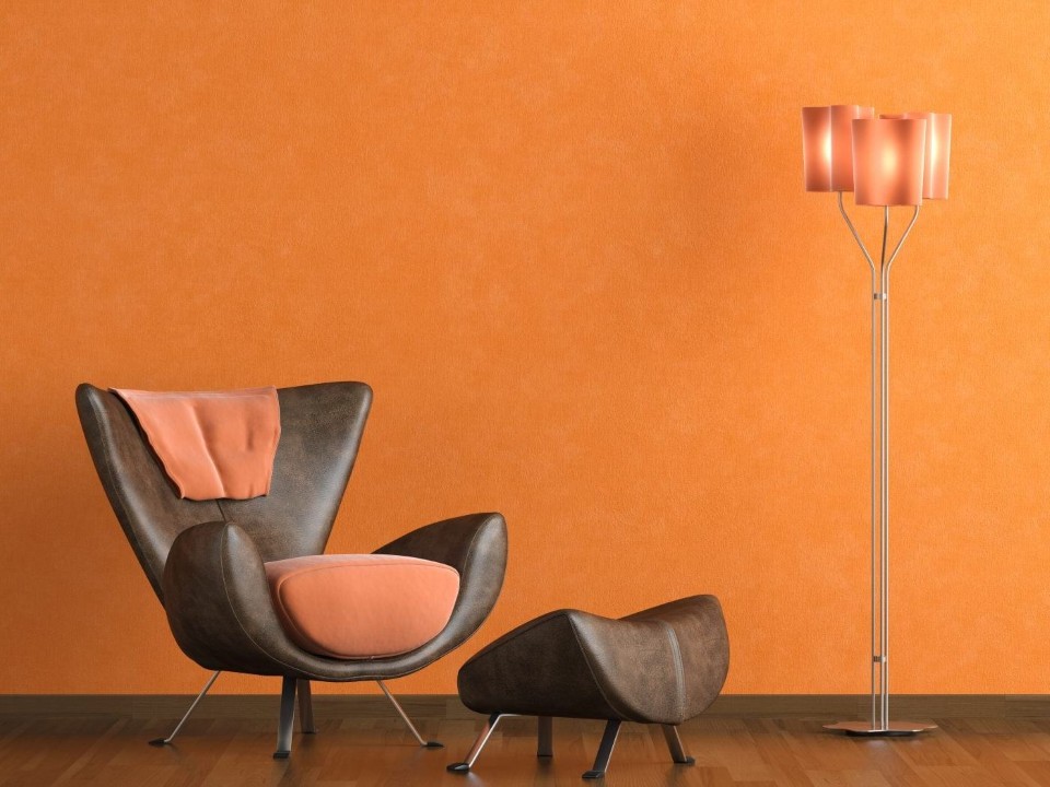
- Terracotta / Rust: Orange mixed with brown/black (Earthy and grounding).
- Peach / Coral: Orange mixed with white (Soft and playful).
- Tangerine: Pure, saturated orange (Energetic and modern).
By understanding color theory, you will more easily find what specific shade of a color matches your specific shade of orange. This knowledge unlocks endless palettes for your dream home.
Colors That Match With Orange – The Definitive List
After mastering the basics of color theory, it is time to apply that knowledge to real-world decor. We have curated a list of the most effective, stylish, and mood-altering color combinations featuring orange. Whether you want a retro vibe, a modern look, or a calming oasis, there is a match for you here.
-
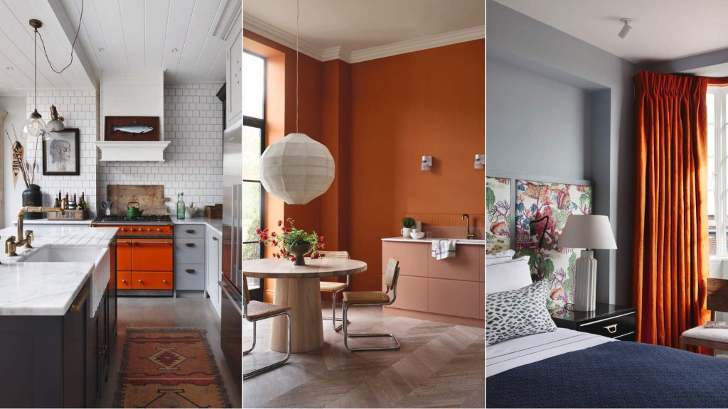
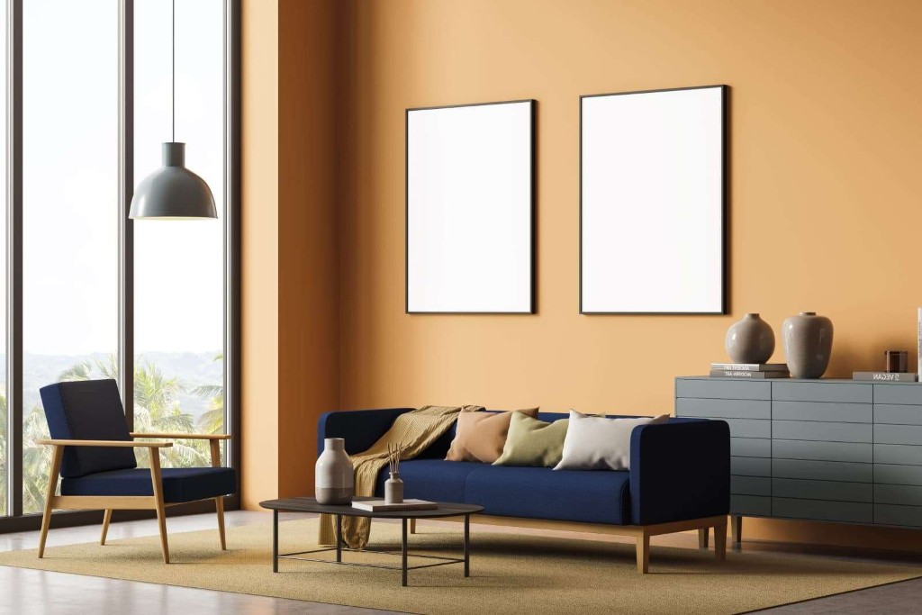
Blue and Orange: The Classic Complement
Blue and orange are complementary colors, meaning they are the definition of “opposites attract.” If you want to balance a cheerful, hot orange, you absolutely must match it with a cool blue. The contrast between the fire of orange and the ice of blue creates a dynamic yet balanced atmosphere.
How to Style It:
- Navy and Burnt Orange: This is a sophisticated, masculine pairing perfect for libraries or living rooms. A deep navy blue wall serves as a dramatic backdrop for a burnt orange velvet sofa. The darkness of the navy absorbs light, while the orange reflects it, creating a cozy depth.
- Teal and Tangerine: For a more modern, mid-century vibe, pair a teal rug with bright tangerine throw pillows.
- Psychological Effect: The existence of contrasting colors is refreshing to the eye. Blue calms the mind, while orange stimulates conversation. Together, they make your mood different—alert yet relaxed.
-
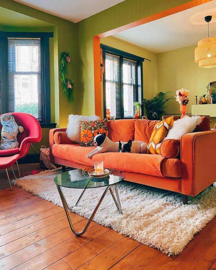
Golden Orange, Desert Sand, and Brown: The Earthy Monochromes
If high contrast isn’t your style, look to nature. There are a lot of colors that match with orange in the “analogous” sector, such as reddish-yellow, beige, and brown. This color palette mimics the breathtaking landscape of a desert at sunset. The reddish color of the sand blends with golden orange sunlight and the brown of dried wood.
How to Style It:
- The Texture Strategy: Since these colors are similar in tone, you need texture to prevent boredom. Combine a smooth golden orange leather chair with a rough desert sand linen curtain and dark brown hardwood floors.
- Decor Elements: Apply brown through various decorations made of wood, rattan, or woven bamboo. Use golden orange in your “soft” items like lampshades and cushions.
- Psychological Effect: If you want a peaceful, calm, and modest atmosphere, this is the palette for you. It feels “grounded” and safe, making it excellent for bedrooms or cozy dens.
-
Orange and Bottle Green: The Organic Retreat
Moving slightly away from blue on the color wheel, we find green. The color of a dark “glass bottle green” (or forest green) is incredibly harmonious with orange. While blue offers contrast, green offers context—it reminds us of an orange tree: bright fruit against dark leaves.
How to Style It:
The Jungle Look: You can create an earthy, botanical home atmosphere with this combination. Paint an accent wall in a matte bottle green. Place a burnt orange armchair or ottoman in front of it. The orange will pop vividly against the dark green background.
- Plant Life: If you don’t want to paint walls green, use actual plants. Large indoor plants like a Fiddle Leaf Fig or Monstera provide that lush green color naturally. Place them in terracotta (orange) pots to nail this look effortlessly.
- Psychological Effect: This combination creates a calm and soothing atmosphere that feels connected to the outdoors. It is perfect for those who want a house with a peaceful, natural vibe.
-
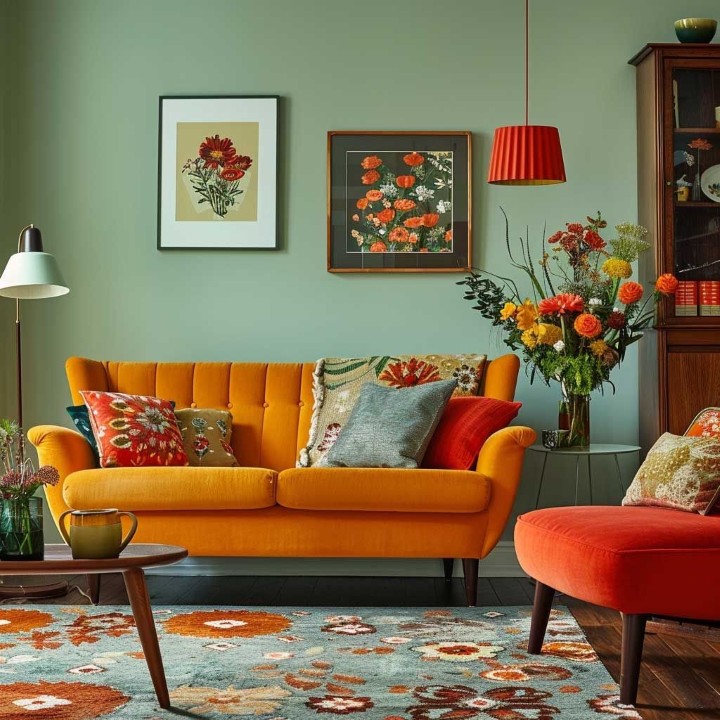
Orange and Aqua: The Retro Revival
If you want to have a house with a fun, retro feel, this combination is perfect for you. The mix of aqua (a cyan-blue) and orange transports you straight to the stylish atmosphere of the 1950s and 70s Modernism. It is very refreshing because aqua is light and airy, preventing the orange from feeling too heavy.
How to Style It:
- Kitchen & Dining: You can find lots of retro appliances (like toasters or fridges) in aqua. Pair these with orange bar stools or an orange backsplash.
- Living Area: Use a soft aqua paint for the walls to make the room feel spacious. Then, add shades of orange to the curtains, geometric rugs, or trinkets.
- Psychological Effect: This duo makes your home atmosphere cheerful, lively, and youthful. It is ideal for creative spaces, playrooms, or a breakfast nook where you want to wake up with energy.
-
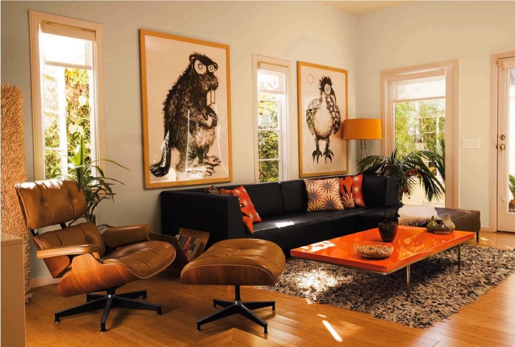
Orange, Gold, and Black: The Luxury Industrialist
For those who prefer drama and opulence over “cheerfulness,” the triad of orange, gold, and black is unbeatable. Orange, usually seen as a casual color, becomes instantly elevated when paired with these two bold shades.
How to Style It:
The “Middle East” or “Art Deco” Concept: You can find a combination of these three colors in Moroccan or Art Deco designs. Think of a black wall, a gold-framed mirror, and plush orange silk pillows.
- Modern Industrial: Use black metal light fixtures and black window frames. Pair them with “Rust” orange brick walls or leather furniture. Add touches of brushed gold in the cabinet handles or table legs.
- Psychological Effect: The existence of black makes the other colors pop, while gold adds a layer of prestige. This palette creates a luxurious, warm, and intimate atmosphere, perfect for a dining room or a master bedroom.
-
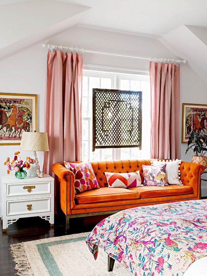
Orange, Red, and Mauve: The Sunset Gradient
This is a daring choice for the true color lover. There are several colors that match with orange on the “warm” side of the wheel, such as red and mauve (a brownish-purple). This is an analogous color scheme that mimics the colors of a vibrant twilight.
How to Style It:
- The Berry Palette: Mauve acts as the bridge. It is close enough to red to blend in, but has enough blue in it to cool down the palette.
- Soft Textures: Because these colors are intense, use them in soft textures. A mauve rug, a terracotta (orange) sofa, and deep red velvet throw blankets.
- Psychological Effect: The combination of orange, red, and mauve creates a romantic, passionate, and heavily saturated look. It wraps the room in warmth. If you want your home decor to feel like a warm hug, try these three colors.
-
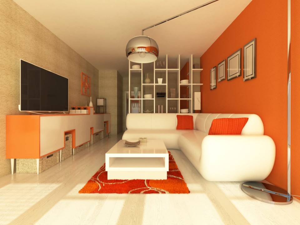
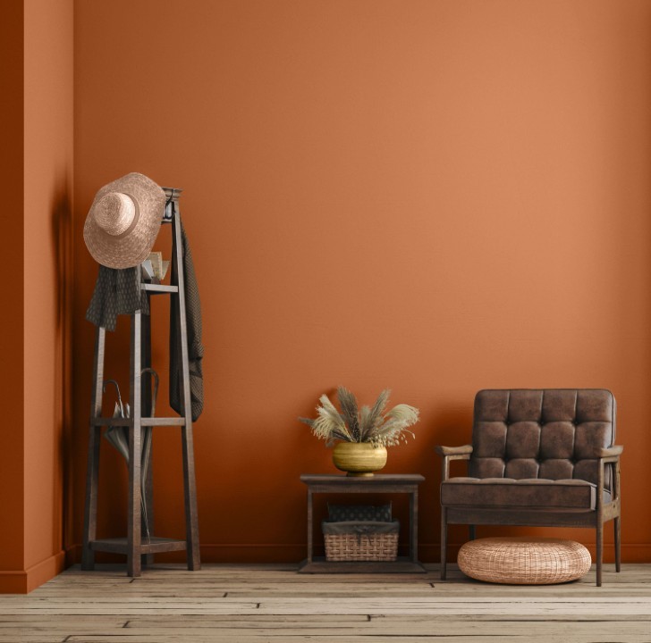
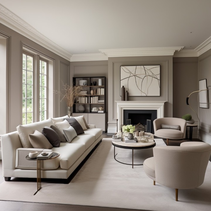
Orange, White, and Warm Gray: The Scandi-Pop
Finally, for the minimalists. If the idea of green or purple walls scares you, look to the neutrals. The next colors that match with orange are white and warm gray. These three colors complement each other by offering balance. White provides light, gray provides structure, and orange provides the “soul.”
How to Style It:
The 60-30-10 Rule: Use white for 60% of the room (walls), warm gray for 30% (sofa/flooring), and orange for the final 10% (accent pillows, art, or a single chair).
- Avoiding Boredom: If you only use gray and white, the room will look boring and clinical. You need one bright and cheerful color to bring it to life. A single piece of orange abstract art on a white wall can change the entire feel of the room.
- Psychological Effect: This is a clean, modern, and spacious palette. It feels organized and airy but has enough warmth (thanks to the orange) to prevent it from feeling like a hospital.
Professional Tips for Decorating with Orange
Knowing the colors is step one. Knowing how to apply them is step two. Here are three expert tips to ensure your orange renovation is a success.
-
Light Lighting Matters
Orange is highly susceptible to lighting conditions.
- Natural Light: In a room with lots of sunlight, orange will appear brighter and more intense.
- Artificial Light: Under warm yellow bulbs (2700K), orange will glow and look redder. Under cool white bulbs (4000K), it can look brown or muddy. Always test your paint swatches in both day and night lighting before committing.
-
Texture is Key
Orange looks different on different materials.
- Velvet/Wool: Absorbs light, making orange look deep, rich, and luxurious (great for burnt orange).
- Plastic/Metal: Reflects light, making orange look bright and “pop” (great for retro tangerine).
- Cotton/Linen: Softens the color, making it look earthy (great for peach or terracotta).
-
Start Small
If you are afraid of painting a whole wall orange, start with “impermanent” decor. Flowers, throw blankets, books, or a rug are low-risk ways to see if you enjoy living with this high-energy color.
Conclusion: Why Orange Deserves a Confident Place in Interior Design
Orange is often misunderstood in interior design. For many homeowners, it feels risky—too bold, too loud, too emotional. But in reality, orange is not a color to be feared. It is a color to be understood, respected, and intentionally used. When applied with the right context and color theory, orange becomes one of the most versatile and expressive hues you can bring into a home.
Unlike neutral colors that fade quietly into the background, orange participates in a space. It interacts with light, materials, and emotions. This is exactly why designers continue to return to it decade after decade—especially in homes that aim to feel warm, energetic, and alive rather than sterile or overly safe.
What Orange Represents in Interior Spaces
At its core, orange is a blend of red’s energy and yellow’s optimism. Psychologically, it is associated with warmth, creativity, enthusiasm, and social connection. This makes it particularly effective in spaces where people gather or move frequently.
Where Orange Works Best
- Living rooms – encourages conversation and warmth
- Dining rooms – stimulates appetite and social energy
- Kitchens – adds vibrancy without the aggression of red
- Entryways – creates a welcoming first impression
- Creative spaces or home offices – boosts motivation and originality
Orange is not typically recommended for bedrooms in large doses, but when softened with neutrals or used as an accent, it can still work beautifully.
Why Color Theory Matters When Using Orange
One of the biggest mistakes people make with orange is using it without understanding color relationships. This is where color theory transforms interior design from a guessing game into a strategic decision-making process.
-
Complementary Colors (Orange + Blue)
Orange’s direct opposite on the color wheel is blue. This pairing creates high contrast and high energy.
Why it works:
Blue cools down orange’s intensity, while orange prevents blue from feeling cold or flat.
Best used when:
- You want a bold, modern, or contemporary look
- You are designing a statement space (accent wall, focal furniture)
- Tip: Use navy or muted blue instead of bright blue for a more sophisticated result.
-
Analogous Colors (Orange + Red + Yellow)
Analogous schemes use colors that sit next to each other on the wheel.
Why it works:
This creates harmony and flow, because the colors naturally relate to each other.
Best used when:
- You want warmth without sharp contrast
- You are inspired by desert, bohemian, or Mediterranean aesthetics
Examples:
- Burnt orange walls with terracotta accents
- Soft amber combined with warm beige and ochre
-
Neutral Pairings (Orange + White + Gray)
This is the safest and most versatile approach—and the best starting point for beginners.
Why it works:
Neutrals give orange room to breathe. They control its intensity and prevent visual overload.
Best used when:
- You are new to bold colors
- You want a modern, minimal, or Scandinavian feel
- You plan to sell or rent the home in the future
This palette allows orange to act as an accent rather than a dominant force.
When to Use Orange (and When to Hold Back)
Use Orange When:
- A room feels flat, cold, or lifeless
- You want to create a focal point
- Natural light is abundant
- You want a space to feel welcoming and expressive
Be Careful With Orange When:
- The room is very small and poorly lit
- You already have many competing colors
- You plan to use highly saturated orange on all walls
In these cases, orange works best as an accent, not a full-room commitment.
Practical Design Recommendation for Beginners
If you are just starting your journey with orange, the most balanced and forgiving palette is:
Orange, White, and Warm Gray
Why this works so well:
- White reflects light and keeps the space fresh
- Warm gray adds sophistication and balance
- Orange provides personality without overwhelming the senses
Once you feel comfortable, you can layer in deeper tones like navy blue, forest green, or charcoal to elevate the design and add depth.
Cost Estimation: What It Really Costs to Use Orange in Interior Design
Understanding the cost is essential before committing to any design choice. Below is a realistic cost breakdown for incorporating orange into a home interior in the United States.
-
Interior Painting Costs (Professional)
Average professional interior painting costs:
- $2 – $6 per square foot (labor + materials)
Cost Example (Accent Wall Only)
- 120–150 sq ft wall
- Cost: $300 – $900
Cost Example (Full Room)
- 12’ x 14’ room
- Cost: $800 – $2,500
Why orange may cost more:
- Requires primer (especially over dark or cool colors)
- Often needs 2–3 coats for even saturation
- Custom orange tones may require color mixing
Expect 10–20% higher costs compared to neutral paint colors.
-
Furniture & Accent Costs
If you prefer not to paint, orange works exceptionally well through furniture and décor.
| Item | Average Cost |
| Accent chair | $300 – $1,200 |
| Sofa with orange upholstery | $1,200 – $3,500 |
| Throw pillows (set) | $60 – $200 |
| Area rug with orange tones | $250 – $1,500 |
| Curtains or drapery | $150 – $800 |
This approach allows flexibility and lower long-term risk.
-
Lighting & Accessories
Orange pairs beautifully with warm lighting.
- Table or floor lamps: $100 – $600
- Decorative ceramics or vases: $50 – $300
- Wall art with orange elements: $200 – $2,000+
Budget Scenarios
Low Budget ($300 – $800)
- Orange pillows
- Artwork
- Small décor pieces
Medium Budget ($1,500 – $4,000)
- Accent wall + accessories
- Area rug and lighting upgrades
High Budget ($6,000 – $12,000+)
- Full room repaint
- Upholstered furniture
- Designer lighting and décor
Orange is not just a color—it is a design statement. When used with intention, guided by color theory, and balanced with the right neutrals, it can transform a space from ordinary to unforgettable.
Start small. Learn how the color behaves in your light and layout. Build confidence layer by layer. Once you understand how orange interacts with white, gray, blue, or green, it stops being intimidating and starts becoming empowering.
Go ahead—add that splash of citrus. When done right, orange doesn’t overwhelm a home.
It awakens it.