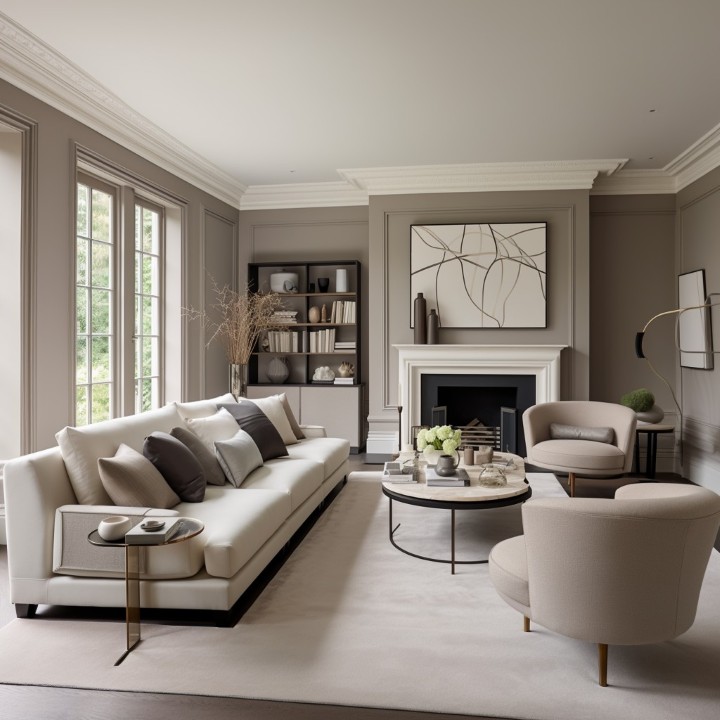
Gray has arguably become the most influential color in 21st-century interior design. Often referred to as the “new white,” it offers a level of sophistication and versatility that few other hues can match. However, the rise of gray has also brought a common challenge: without the right pairing, a gray room can feel cold, sterile, or even gloomy.
Because gray is a “cool” color by nature, it acts like a mirror to its surroundings. It picks up the tones of your furniture, the temperature of your lighting, and the colors of your accents. To create a home that feels balanced and alive, you must master the art of color coordination. In this comprehensive guide, we will explore the best color pairings for gray and the essential “dos and don’ts” to transform your living space.
The Science of Gray: Why Undertones Matter
Before we dive into the pairings, it is vital to understand that “gray” is rarely just gray. Almost every gray paint or fabric has an undertone—usually blue, green, purple, or brown.
- Cool Grays: Have blue or green undertones. They feel crisp and modern but can feel “icy” in rooms with little natural light.
- Warm Grays (Greige): Have yellow, brown, or red undertones. These feel cozy and inviting, making them perfect for bedrooms and living areas.
Understanding these undertones is the first step in choosing a matching color. Now, let’s look at the eight most effective color combinations for a gray-themed home.
8 Stunning Color Combinations for a Gray Home
-
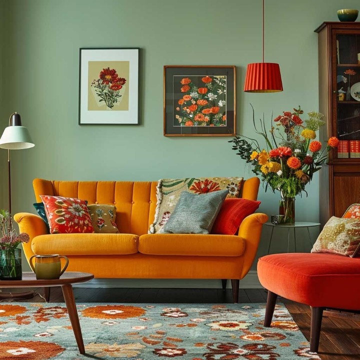
Gray and Yellow: The Sunshine Effect
If you want to breathe life into a muted space, the combination of gray and yellow is an undisputed classic. Gray provides a stable, calm foundation, while yellow introduces a burst of optimism and energy.
- How to Style It: In a living room, a charcoal gray sofa serves as a sophisticated anchor. You can then layer in “pops” of citrus or mustard yellow through throw pillows, a textured rug, or a statement armchair.
- Pro Tip: This pairing works exceptionally well in kitchens. Imagine light gray cabinetry paired with yellow bar stools or a vibrant lemon-themed backsplash. It creates a space that feels clean yet cheerful for your morning coffee.
-
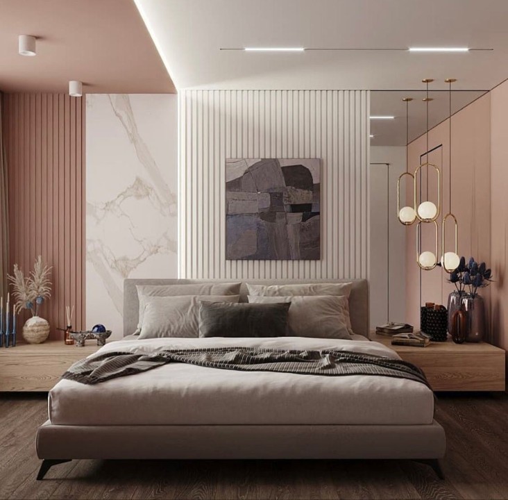
Gray and Blush Pink: Sophisticated Softness
For homeowners who gravitate toward “Scandi-chic” or “Modern Industrial” styles, gray and blush pink offer a perfect marriage of masculine and feminine energies. The coolness of the gray prevents the pink from looking too “sugary” or juvenile.
- How to Style It: This is a top-tier choice for bedrooms and nurseries. A light dove-gray wall paired with dusty rose bedding creates a serene, spa-like atmosphere.
- The Material Connection: To elevate this look, incorporate metallic accents like copper or rose gold. The warmth of the metal complements the pink tones beautifully against the neutral gray backdrop.
-
Gray and Navy Blue: The Timeless Professional
Navy blue is perhaps the most natural partner for gray. Both colors share a certain “weight” and maturity, making the room feel grounded and expensive. Because navy blue is also a cool-toned color, the two blend seamlessly.
- How to Style It: If you have a home office or a formal dining room, try painting an accent wall in a deep navy blue and furnishing the room with light gray upholstered chairs.
- Lighting Check: Since both colors are on the darker side of the spectrum, ensure you have plenty of “layered lighting” (floor lamps, sconces, and overhead fixtures) to prevent the room from feeling like a cave.
-
Gray and Vibrant Green: The Biophilic Connection
In recent years, “Biophilic Design”—the practice of bringing the outdoors in—has exploded in popularity. Vibrant green (like emerald, forest, or sage) paired with gray mimics the look of stone and foliage in nature.
- How to Style It: Use gray as your “canvas” (walls and floors) and let the green come from living elements. A large fiddle-leaf fig or a collection of monstera plants against a gray wall creates an instant focal point.
- The Psychological Impact: Green is known to reduce stress and improve focus. Combining it with the neutrality of gray creates a balanced environment perfect for relaxation.
-
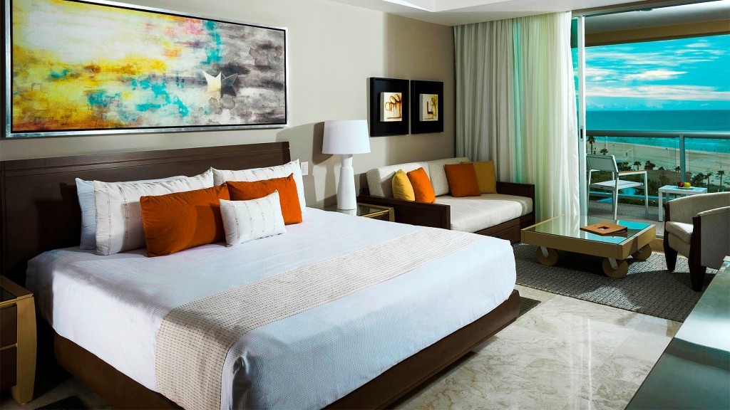
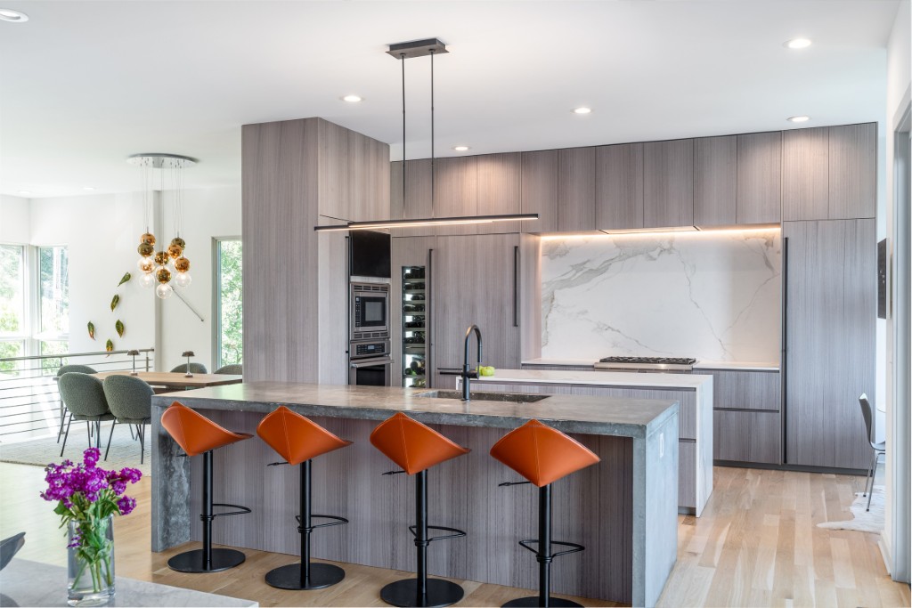
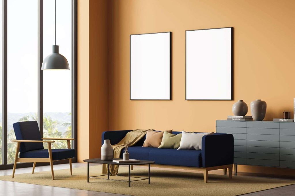
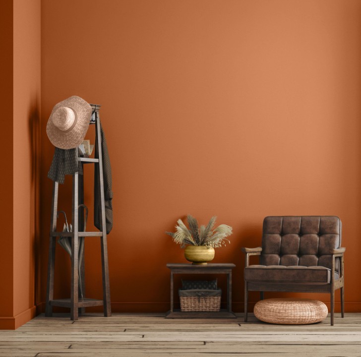
Gray and Mild Orange: The Warm Contrast
Orange is a bold, high-energy color that can often be overwhelming on its own. However, when paired with gray, its intensity is “tamed.” This combination is perfect for those who want a home that feels warm and adventurous.
- How to Style It: Look for “burnt” or “mild” orange rather than neon shades. A rust-colored leather ottoman or terracotta vases placed on a gray mantlepiece provide a beautiful, earthy contrast.
- Warmth Balance: This pairing is particularly effective in northern-facing rooms that don’t get much sunlight, as the orange adds a much-needed “faux warmth” to the space.
-
Gray and Pure White: Minimalist Elegance
For the purists who love a clean, “uncluttered” aesthetic, the combination of gray and pure white is unbeatable. It is the hallmark of minimalist and modern farmhouse styles.
- How to Style It: Think white marble countertops in a kitchen with light gray cabinetry, or white sheer curtains against a gray-painted wall.
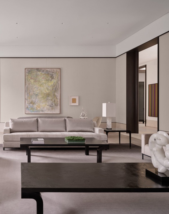
- The Importance of Texture: When using two neutral colors, the “secret sauce” is texture. Without it, the room looks flat. Combine a gray wool rug, white linen sofas, and a white wooden coffee table to create visual interest through touch rather than color.
-
Gray, Teal, and Black: Dramatic Luxury
If you want your home to make a statement, look no further than the trio of gray, teal, and black. Teal is a unique secondary color—a mix of blue and green—that adds a “jewel-toned” luxury to a room.
- How to Style It: Use a mid-tone gray for the walls. Introduce teal through velvet curtains or a plush area rug. Finally, use black as an “outline” color—black picture frames, black light fixtures, or black table legs.
- The Mood: This palette creates a moody, “boutique hotel” vibe that is perfect for a master bedroom or a cozy lounge area.
-
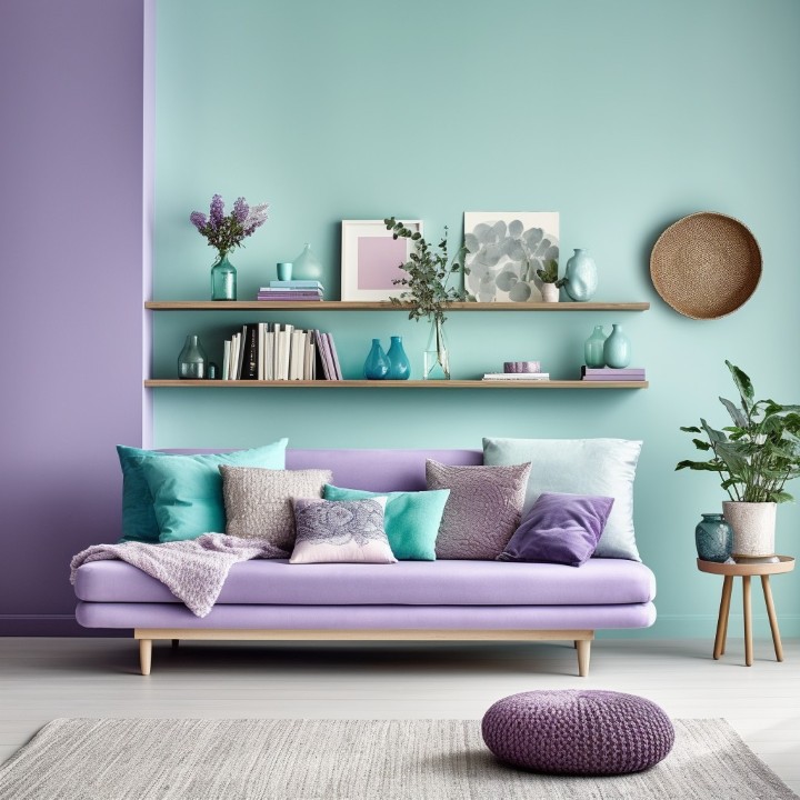
Gray, Violet, and White: The Fashion-Forward Palette
Violet (or lavender) is a color associated with creativity and luxury. When combined with gray and white, it transforms a room into a high-fashion space that feels both glamorous and tranquil.
- How to Style It: This works wonderfully in a dressing room or a formal sitting area. A soft lavender accent wall behind a gray velvet headboard, trimmed with white molding, creates a look that is both feminine and sophisticated.
The Comprehensive Do’s and Don’ts of Decorating with Gray
Now that you have your color palette, you need to know how to apply it. Decorating with gray is a subtle art. Here is a breakdown of the rules to ensure your renovation is a success.
The Do’s: The Path to Success
-
Do Understand the Power of “Greige”
One of the most versatile shades in the designer’s toolkit is Greige (Gray + Beige). Greige is the perfect solution for those who are afraid that gray will feel too “cold.” Because it contains brown/tan elements, it feels warm under incandescent light but retains the modern edge of gray.
-
Do Sample Your Paint in Different Lights
Gray is a “chameleon” color. A shade that looks like a beautiful silver in the store might look like “mud” in your hallway or “baby blue” in your bedroom.
- Tip: Paint a large swatch (at least 2 feet by 2 feet) on your wall and observe it at 8:00 AM, 1:00 PM, and 8:00 PM. The shift in natural vs. artificial light will change the color entirely.
-
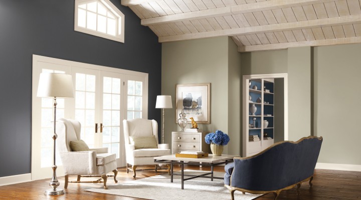
Do Use Charcoal Gray as a Sophisticated Alternative to Black
If you want to create a dramatic, dark space, black can often feel too harsh or “flat.” Charcoal gray provides the same depth and drama but with a softer, more inviting edge. It is an excellent choice for accent walls, kitchen islands, or exterior doors.
-
Do Mix Different Shades of Gray
Don’t feel like you have to stick to just one shade of gray in a room. Using a “tonal” approach—combining light gray, mid-tone gray, and dark charcoal—adds depth and prevents the room from looking like a single, flat block of color.
The Don’ts: Mistakes to Avoid
-
Don’t Ignore the “Natural Color” Connection
Many people forget that gray is a color found in nature—think of pebbles, weathered driftwood, and mountain stone.
- The Mistake: Using gray with purely synthetic materials and plastic textures.
- The Fix: Combine gray with natural elements. A gray room with a reclaimed wood coffee table or a stone fireplace feels grounded and organic rather than artificial.
-
Don’t Be Afraid of “Neutral on Neutral”
There is a common misconception that you must have a bright color to make gray work. That isn’t true. You can create a stunning room by layering gray with other neutrals like beige, cream, or tan. The key is to vary the values (how light or dark the colors are) so they don’t blend together.
-
Don’t Forget About Metallics
Gray can sometimes look a bit “matte” or dull. To give it life, you need something that reflects light.
- The Mistake: Using gray walls, gray furniture, and gray rugs without any shine.
- The Fix: Incorporate metallics. Chrome and silver enhance the “coolness” of gray, while brass, gold, and bronze add a “warmth” that creates a luxury feel.
-
Don’t Overlook the Ceiling
When people paint a room gray, they often leave the ceiling “stark white.” This can create a harsh line that makes the ceiling feel lower.
- The Fix: Try painting the ceiling a very pale, “whisper” gray. This softens the transition and makes the room feel more cohesive and expensive.
- Gray in Specific Rooms: A Quick Guide
To help you visualize your project, here is how to apply these gray principles in different areas of the house:
| Room | Recommended Pairing | Why it Works |
| Living Room | Gray & Mild Orange | Creates a cozy, conversational atmosphere. |
| Kitchen | Gray & Pure White | Feels clean, hygienic, and timeless. |
| Bedroom | Gray & Blush Pink | Promotes relaxation and a sense of “softness.” |
| Home Office | Gray & Navy Blue | Encourages focus, authority, and professionalism. |
| Bathroom | Gray & Vibrant Green | Creates a “spa-at-home” feel with a natural touch. |
The Psychology of Decorating with Gray
Why are we so drawn to gray? Psychologically, gray represents neutrality and balance. It is the color of compromise—neither black nor white. In an increasingly chaotic world, homeowners are turning to gray to create a “sanctuary” that feels quiet and controlled.
However, because gray is the color of “shadow,” too much of it can lead to feelings of isolation. This is why the color combinations mentioned above are so important. By adding a touch of yellow (happiness), green (growth), or pink (compassion), you are balancing the “stillness” of gray with the “emotion” of color.
Conclusion: Why Gray Still Works—When Done Right
Decorating with gray is not merely a trend that comes and goes with social media cycles. It is a design mindset rooted in balance, restraint, and adaptability. Gray works because it knows when to step forward and when to step back—allowing architecture, texture, and light to do the heavy lifting.
That said, gray is not a “safe” color by default. Its naturally cool character demands intention. Without attention to undertones, lighting, and material contrast, gray can quickly feel flat, cold, or lifeless. But when executed thoughtfully, the payoff is substantial.
From the bold energy of gray paired with yellow, to the quiet sophistication of gray and pure white, success always comes down to understanding undertones, respecting proportion, and following the practical do’s and don’ts of gray design. Accent choices—whether vibrant green, navy blue, or warm metallics—are what elevate gray from a neutral backdrop into a space that feels lived-in and personal.
A well-designed gray interior does not shout. It ages gracefully, adapts to lifestyle changes, and continues to feel relevant long after trend-driven colors fade.
Recommendations for Your Next Gray Interior Project
-
Start Small and Observe the Light
If you’re hesitant, begin with a warm gray or greige in a compact space such as a powder room, hallway, or laundry area. Gray behaves very differently under natural daylight versus artificial lighting. Testing it in a smaller room lets you understand how it shifts throughout the day—without committing your entire home.
-
Invest in Texture, Not Just Color
Gray is visually quiet, which makes texture non-negotiable. High-quality materials elevate gray from ordinary to refined.
- Velvet sofas
- Linen curtains
- Wool or textured area rugs
These tactile elements add depth and prevent gray interiors from feeling sterile or unfinished.
-
Treat Hardware and Lighting as Design Statements
In gray interiors, hardware plays the role of jewelry. Cabinet pulls, faucets, and light fixtures become focal points rather than afterthoughts.
- Matte black adds contrast and modern edge
- Satin brass introduces warmth and sophistication
- Brushed nickel offers a balanced, transitional look
Small upgrades here can dramatically shift the overall mood of the space.
-
Always Add Something Alive
A gray room should never exist without a living element. Plants, fresh flowers, or even seasonal fruit bowls inject warmth and movement into an otherwise controlled palette. This simple addition prevents gray from feeling static or overly formal.
Estimated Costs for a Gray-Themed Interior Project (U.S. Average)
Below is a realistic cost breakdown for a professionally finished gray interior, suitable for budget planning:
| Item | Estimated Cost |
| Interior wall painting (gray tones) | $2 – $6 per sq ft |
| Custom warm gray / greige paint upgrade | +10–20% |
| Premium interior paint (per gallon) | $40 – $80 |
| Professional labor | $25 – $55 per hour |
| Area rugs (mid to high quality) | $300 – $1,200 |
| Curtains (linen or custom panels) | $250 – $1,000 |
| Cabinet hardware upgrade | $150 – $600 |
| Decorative lighting fixtures | $200 – $1,500 |
| Indoor plants & décor accents | $100 – $400 |
Total Estimated Investment
- Small room refresh: $800 – $2,000
- Mid-size living space: $3,000 – $6,500
- Full-home gray interior: $6,000 – $12,000+
These estimates reflect professional-quality results, not DIY shortcuts—aligned with expectations of modern homeowners and advertisers alike.
Gray interiors succeed not because they are neutral, but because they are intentional. When balanced with texture, contrast, and warmth, gray becomes a timeless foundation that adapts to personal taste and future design changes. Done correctly, it doesn’t just look good—it lasts.