Playing with colors is far more than a decorative exercise; it is an emotional journey. Engaging in the “mix and match” process offers a specialized experience in atmosphere-building, allowing a homeowner to dictate the energy of a room before a single piece of furniture is even moved. When you successfully pair hues, the resulting harmony provides a deep sense of satisfaction. Conversely, a mismatched palette can ruin a view, creating visual friction that leaves a space feeling unsettled.
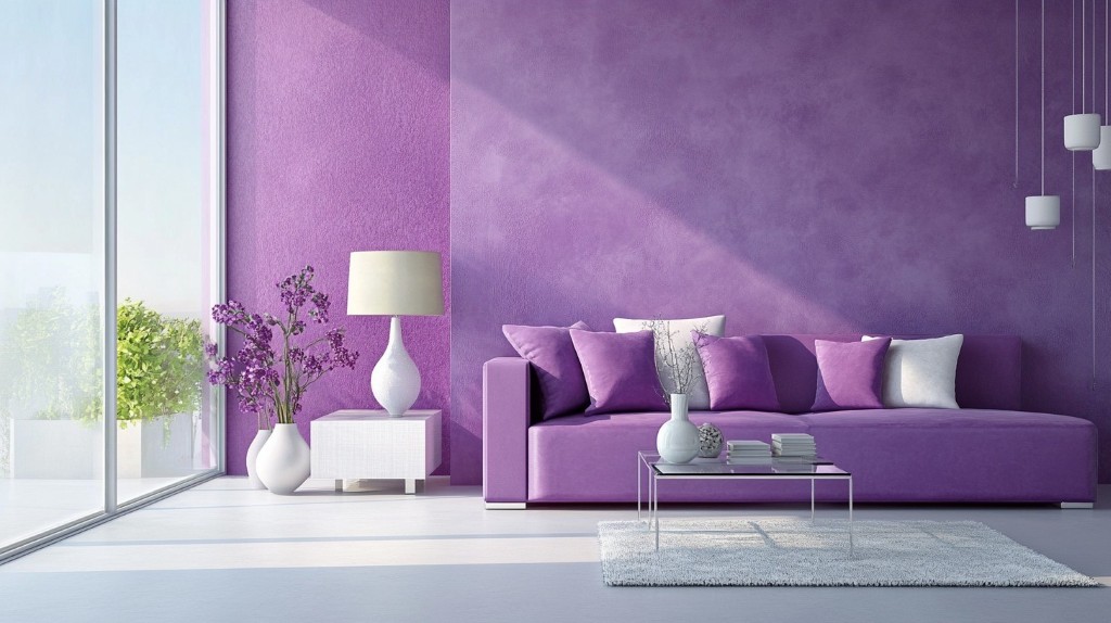
Among the spectrum of possibilities, purple stands as one of the most complex candidates. Historically known as the color of mystery, royalty, and high-energy spirituality, it is a hue that demands respect. While it is free to combine with many other colors, one must exercise a high degree of nuance. Because purple is not a “primary” color, but rather a secondary one born from the marriage of red and blue, it carries the genetic traits of both. This dual nature—the fire of red and the ice of blue—makes it a “chameleon” in interior design.
In this masterclass, we will explore the “what, why, and when” of purple color theory, providing you with a specific roadmap to solve the problem of a “boring” or “clashing” home aesthetic.
-
The Soul of Purple: Why It Behaves the Way It Does
To understand what colors match with purple, we must first analyze the “personality” of the hue. If purple were a person, it would be a mature individual—perhaps a lady of high society or a scholar full of deep, hidden ideas. It represents the bridge between the physical and the spiritual, often linked to sensitivity, imagination, and the avant-garde.
The reason purple requires such careful attention is its value and saturation. Because it sits between two primary colors on the spectrum, it can lean “warm” (more red, like plum or magenta) or “cool” (more blue, like violet or periwinkle).
- When to use warm purples: These are best used in social spaces like dining rooms or living areas where you want to foster a sense of “mysterious aggression” or brave excitement.
- When to use cool purples: These are ideal for sanctuaries—bedrooms and meditation spaces—where the blue undertones can lower the heart rate and spark imagination without the heat of red.
The Lighting Factor
Before you commit to a purple palette, you must understand the “Metamerism” of the color—the way it changes under different light sources. Under yellow incandescent light, a purple wall may look brown or muddy. Under blue-toned LED or natural northern light, it may look cold and stony. Always test your purple combinations during the “golden hour” (sunset) to ensure the mystery doesn’t turn into gloom.
-
Master Palette: 8 Stunning Combinations for Purple Home Decor
Designing with purple is a balance of contrast and harmony. Below are eight specific, in-depth strategies for pairing purple with other colors to solve common design dilemmas.
-
Purple and Pink: The Feminine Sophisticate
Many see pink as purple’s “little sister.” Because they share a red base, they sit near each other on the color wheel, creating an analogous harmony.
- The Why: This combination feels safe and familiar to the human eye. It creates a sensation of absolute femininity and softness.
- The Application: To avoid making the room look “sugary” or juvenile, use a deep, saturated plum purple for the upholstery (like a velvet sofa) and pair it with a very dusty, muted blush pink for the walls. This creates a “grown-up” version of the pink-purple duo.
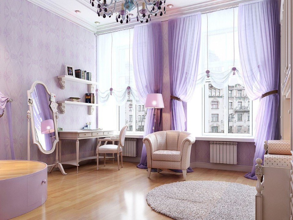
- When to use: Perfect for a master bedroom or a chic walk-in closet where comfort and luxury are the primary goals.
-
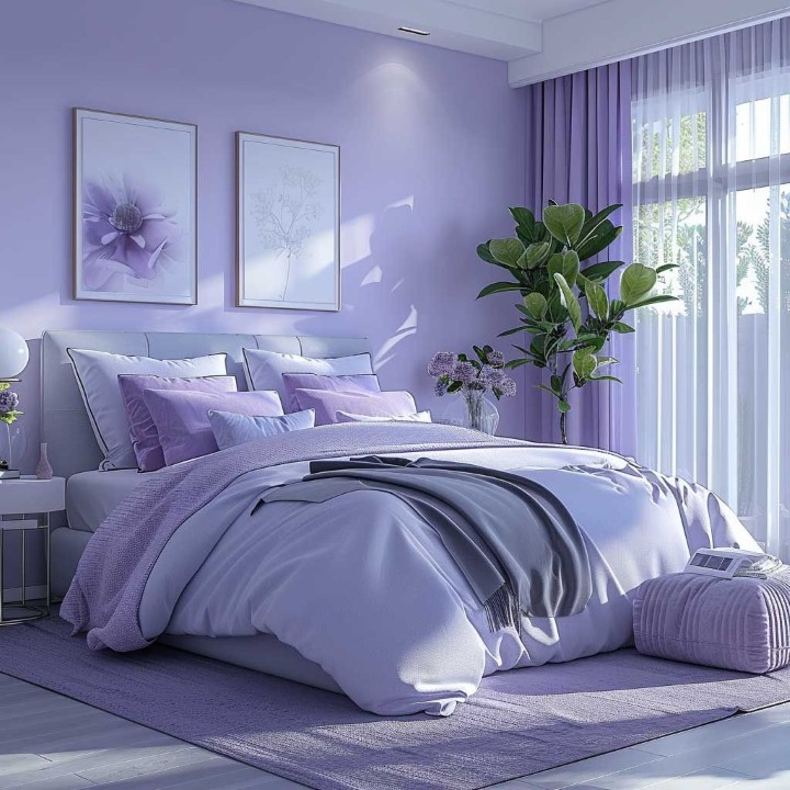
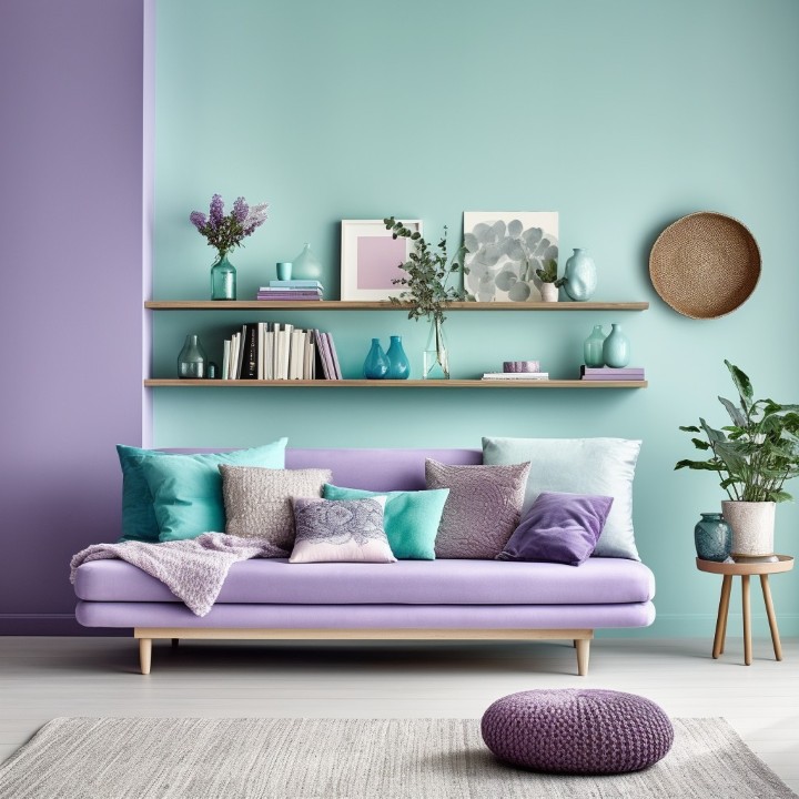
Purple and Warm Blue: The Mysterious Sanctuary
When purple meets blue, the energy is one of deep immersion. Blue is the parent color of purple, so this is a “monochromatic-adjacent” pairing that feels incredibly stable.
- The Why: Blue reflects calm, while purple reflects mystery. Together, they create a room that feels “closed” in a positive way—like a protective cocoon.
- The Application: Use navy blue as the anchor (rugs or curtains) and introduce violet accents through pillows or art. This strengthens the “royal” feeling of a room without making it feel aggressive.
- When to use: Highly recommended for libraries, home offices, or media rooms where focus and quietude are necessary.
-
Light Grey and Soft Lilac: The Traditional Modernist
Traditional decoration often relies on neutral bases, but purple can be a neutral too if the saturation is low enough.
- The Why: Light grey provides a “clean” slate that absorbs the eccentricities of purple. This combination creates a sensation of “charm and mystique” while remaining bright and airy.
- The Application: In a kitchen or bathroom, use light grey tiles with lavender-hued towels or a lilac accent wall. Add a large mirror to reflect light, which prevents the soft purple from appearing “muddy.”
- When to use: Use this when you want to make a small room look larger and more “expensive” without using traditional beige.
-
Purple, White, and Earthy Brown: The Calm Classic
White is the ultimate “boundary-free” color, but when combined with purple and brown, it creates a “mysteriously classic” vibe.
- The Why: Brown (wood tones) grounds the flighty, imaginative nature of purple. White provides the “breath” the room needs to stay fresh.
- The Application: Imagine a room with dark walnut wood floors (Brown), crisp white walls, and a soft lavender area rug. The energy is one of stability (brown) mixed with special creative energy (purple).
- When to use: Ideal for transitional spaces like entryways or hallways where you want to make a sophisticated first impression.
-
Purple and Yellow Tint: The Majestic Complementary
On the color wheel, yellow is the direct opposite of purple. In color science, opposites create the highest level of visual tension and “vibrancy.”
- The Why: Because they are complementary, they balance each other’s “stability.” Yellow provides the light that purple lacks, while purple provides the depth that yellow needs.
- The Application: This is for the brave. Use a “mustard” or “ochre” yellow rather than a neon yellow. A purple accent wall behind a mustard-yellow armchair creates “indescribable awesomeness.”
- When to use: Use this in creative studios or “funky” modern living rooms where you want to spark conversation and energy.
-
Purple and Dark Grey: The Industrial Muse
If you want a warm room that doesn’t feel “fiery” (like red or orange), dark charcoal grey is your best partner.
- The Why: This match moves away from the aggressive heat of red-based palettes and moves toward “wild creativity.” It is a sophisticated warmth.
- The Application: Use dark grey for the large surfaces (the “enveloping” surfaces) and deep royal purple for the “touchpoints” (the bedspread, the ottoman, the lamp bases).
- When to use: This is a “power” combination. Use it in a home office if your work requires deep, innovative thinking rather than simple administrative tasks.
-
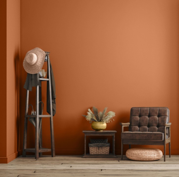
Purple, Orange, and Brown: The Autumnal Soul
Can purple feel like autumn? Surprisingly, yes. While we usually think of orange and brown as the only “fall” colors, purple is the hidden star of the harvest season (think of grapes, plums, and the sky at dusk).
- The Why: Orange provides the heat, brown provides the earth, and purple provides the “cooling” shadow that makes the warmth feel cozy rather than hot.
- The Application: A small touch goes a long way here. Most of the room can be purple, but a single orange throw blanket or a collection of bronze (brown-toned) vases will “flip” the room into a warm, seasonal masterpiece.
- When to use: Best for a dining room where you want to create a rich, feast-like atmosphere.
-
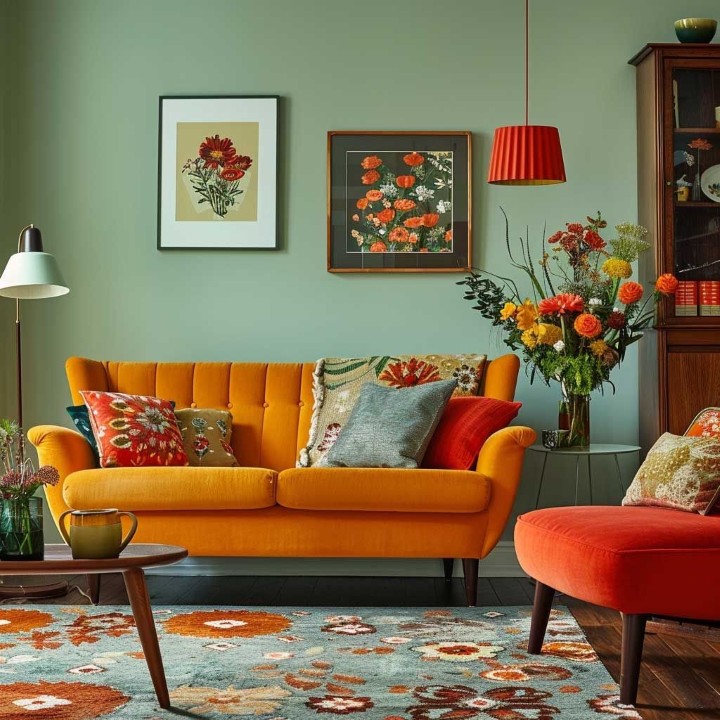
The Multi-Chromatic Palette: The Joyful Rebel
There is a misconception that purple can only sit with one other color. In reality, purple is a fantastic “mediator” for a room with many colors.
- The Why: Because purple contains both warm and cool elements, it can act as a bridge between a blue chair and a red rug.
- The Application: Don’t be limited. Pair purple with teal, gold, and cream all at once. The key is to keep the “vibe” the same. If you are using “jewel tones” (Emerald, Ruby), use a “Jewel” purple (Amethyst).
- When to use: Children’s playrooms, eclectic guest rooms, or “maximalist” spaces where you want to project cheerfulness and lack of restraint.
The “What, Why, and When” of Room-Specific Purple
To truly solve your decoration problems, we must look at how purple functions in different functional zones of the house.
The Bedroom: The “Why” of Sleep
What: Use soft lilacs or deep indigos. Why: Purple promotes REM sleep and imaginative dreaming. However, avoid “bright magenta” purples, as the high red content can increase the heart rate and keep you awake. When: Apply this when you want to prioritize rest and romantic mystery.
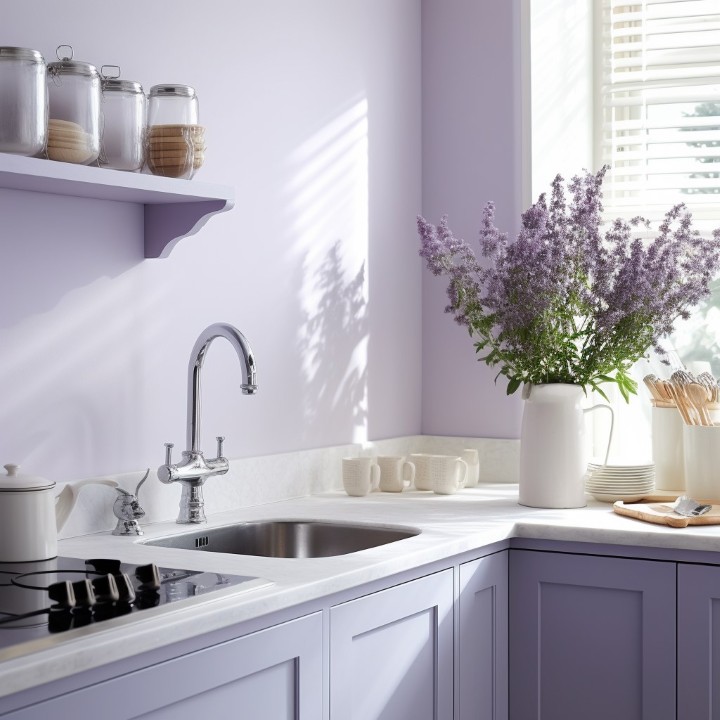
The Kitchen: The “Why” of Appetite
What: Use “food-based” purples like eggplant or plum. Why: Historically, purple is not an “appetite-stimulating” color (unlike red or yellow). However, a deep eggplant kitchen island against white marble feels incredibly high-end and clean. When: Use this when you want a “Chef’s Kitchen” look that feels more sophisticated than a standard white or blue kitchen.
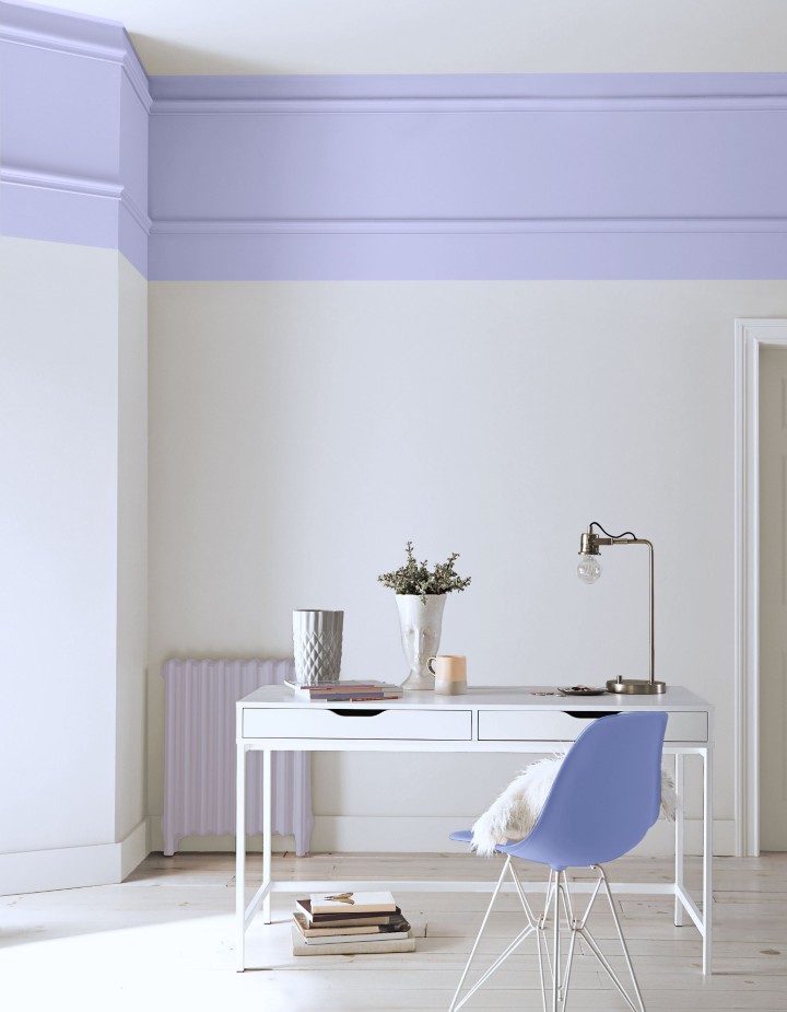
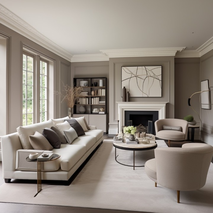
The Small Living Room: The “Why” of Proportion
What: Use purple as an accent rather than a wall color. Why: Too much dark purple in a small room can bring a sense of “impatience and arrogance”—it feels like the walls are closing in on you. When: Use a purple rug or curtains to “boost creativity” without sacrificing the perceived size of the room.
Avoiding the “Purple Pitfalls”: A Diagnostic Guide
Many DIY decorators fail with purple because they ignore the saturation and undertone. Here is how to solve those problems before they happen:
- The “Mud” Problem: If you mix a warm purple (red-undertone) with a cool green (blue-undertone), the colors may “cancel” each other out visually, making the room look grey or muddy.
The Fix: Stick to the same “temperature.” Pair warm purples with warm yellows/oranges. Pair cool purples with cool blues/whites.
- The “Gymnasium” Problem: Using two highly saturated primary/secondary colors (like bright purple and bright green) can make a room look like a sports arena or a fast-food restaurant.
The Fix: Use the 60-30-10 Rule. 60% neutral (White/Grey), 30% soft purple, and only 10% of that bright “pop” color.
- The “Gloom” Problem: In rooms with low natural light, purple can look like black at night, losing its beauty.
The Fix: Use “metallic accents.” Gold, silver, and brass act as “mirrors” that reflect light back into the purple pigment, making the color “glow” even in the evening.
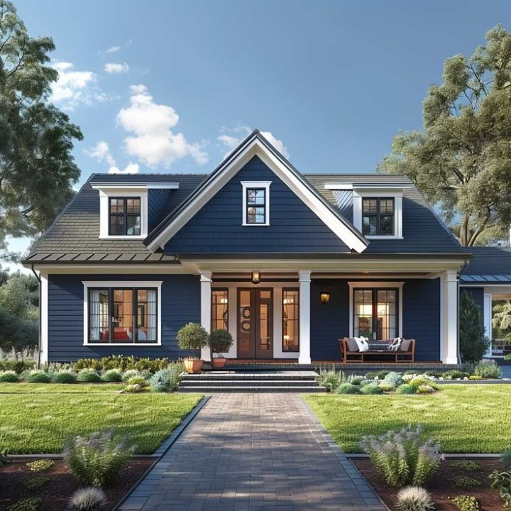
Professional Interior House Painting Cost Estimates in the United States (Custom Purple Color)
This guide provides a detailed and realistic cost breakdown for professional interior house painting services in the United States, with a specific focus on custom-mixed purple paint colors. Costs vary based on home size, wall condition, ceiling height, paint quality, and labor complexity.
-
General Cost Overview for Professional Interior Painting
Professional interior painting costs in the U.S. typically depend on square footage, labor rates, surface preparation, and paint type.
Average Cost Ranges
- $2 to $6 per square foot, including labor and materials, depending on project complexity.
- A 1,500 sq ft home usually costs $3,000 to $8,000+ for full interior painting (walls, ceilings, and trim).
- Premium projects using high-end paint, custom colors, and detailed trim work can reach $10,000 to $15,000 or more.
In short: larger spaces and higher complexity lead to higher total costs.
-
Why Custom Purple Paint Colors Cost More
Custom-mixed colors—especially deep or saturated shades like purple—often increase total costs compared to standard off-the-shelf colors.
Cost-Increasing Factors
- Additional primer required
Dark or vibrant colors typically need extra primer for even coverage. - More paint coats
Purple tones usually require 2–3 coats to achieve consistent color depth. - Longer labor time
Precision work with custom colors increases labor hours.
As a result, custom purple interior paint jobs typically cost 10–20% more than standard neutral colors.
-
Detailed Cost Breakdown by Category
Materials (Paint & Supplies)
- Standard interior paint: $25–$60 per gallon
- Primer: $15–$40 per gallon
- Premium/custom-tinted paint: $40–$80+ per gallon
- Painting supplies (rollers, brushes, tape): $30–$80
A 1,500 sq ft home generally requires 10–15 gallons of paint, bringing total material costs to $600–$1,200+, including primer.
Professional Labor Costs
Labor represents the largest portion of painting expenses.
- Hourly rates: $25–$55 per hour, depending on region and experience
- Per-square-foot pricing: $2–$6 per sq ft, often including materials and labor
Key Factors That Affect Final Pricing
| Factor | Cost Impact |
| Home size | Larger area = higher cost |
| Wall condition | Repairs add extra charges |
| High or vaulted ceilings | Scaffolding/lifts increase cost |
| Trim & architectural details | Additional labor |
| Premium/custom paint | 10–20% higher total |
Realistic Cost Examples
- 1,000 sq ft Home
- Materials: $500–$900
- Labor: $1,500–$3,000
- Total: $2,000–$3,900
- 1,500 sq ft Home
- Materials: $800–$1,200
- Labor: $2,500–$5,500
- Total: $3,300–$6,700
- 2,500 sq ft Home
- Materials: $1,200–$1,800
- Labor: $4,500–$9,000
- Total: $5,700–$10,800
Choosing premium paint, custom purple shades, or extensive trim work can increase costs by 10–30%.
Cost by Area (Optional Breakdown)
- Walls only: $1.50–$3.00 per sq ft
- Ceilings: $1.00–$2.50 per sq ft
- Trim & baseboards: $2.00–$4.00 per sq ft
Tips for Getting Accurate Estimates
Before requesting professional quotes:
- Calculate wall surface area, not just floor space
- Confirm number of coats required for purple shades
- Ask whether ceilings, trim, doors, and windows are included
- Get at least three quotes from local contractors
Real-World Pricing Insights
Homeowners commonly report:
- $7,000–$10,000 for a 2,500 sq ft home in Texas
- $8,000–$16,000 for a 2,000 sq ft home in Oklahoma, depending on ceiling height and details
These examples highlight how location and project scope significantly affect pricing.
Final Summary
| Home Size | Estimated Cost (Custom Purple Interior Painting) |
| ~1,000 sq ft | $2,000–$4,000 |
| ~1,500 sq ft | $3,300–$7,000 |
| ~2,000–2,500 sq ft | $6,000–$11,000+ |
Custom purple interior painting projects typically cost 10–20% more than standard interior paint jobs due to additional primer, coats, and labor.
Conclusion: Mastering the Mystery
Finally, we come to understand that purple is not a color to be feared, but a color to be respected. It is the “specialist’s” color—a hue that allows for a deeply in-depth exploration of human emotion and architectural space. By knowing what colors match with purple—whether it’s the safe femininity of pink, the royal stability of blue, or the brave contrast of yellow—you can move beyond “trial and error” and into the realm of professional design.
Whether you are looking to create a “mysterious sanctuary” or an “inspirational colorful” hub, purple provides the flexibility to achieve both. The key is to remember that purple is a secondary color with a dual soul. Respect the red within it for warmth, and honor the blue within it for calm.
Recommendations for Your Next Project
To ensure your purple project meets the highest standards of quality and aesthetics, we recommend the following steps:
- The “Three-Swatch” Test: Buy three samples of purple: one that is “Red-Purple” (Magenta), one “True Purple” (Violet), and one “Blue-Purple” (Indigo). Paint them on different walls and check them at 10 AM, 3 PM, and 9 PM. The “winner” will be the one that doesn’t turn “muddy” in the shadows.
- Texture is Mandatory: Purple is a “flat” color visually. To give it depth, use textured fabrics. A purple linen curtain looks vastly different from a purple velvet one. Use Velvet for luxury and Linen for a modern, organic feel.
- The Metallic Rule: Always pair purple with a metallic. Gold and Brass highlight the royalty and warmth of purple. Chrome and Silver highlight the mystery and “coolness” of purple. Never leave a purple room without at least one metallic element (a lamp, a frame, or a tray).
- Balance the Neutral: If you are afraid of the color, follow the “surprising contrast” rule: Keep 90% of the room modern and white, but use a “majestic” purple for a single, high-quality piece of classic furniture (like a wingback chair). This creates a focal point that is both classic and modern at the same time.
Would you like me to help you design a specific color palette for a particular room, or perhaps suggest some furniture styles that go well with a deep plum or light lavender theme?