The psychological impact of our living environment has never been more apparent than during the extended periods of staying at home we’ve experienced in recent years. A house isn’t just a shelter; it is a sanctuary that dictates our emotional frequency. If you’ve been feeling a bit “cabin feverish” or find your mood dipping, the solution might not be a change of scenery, but a change of color.
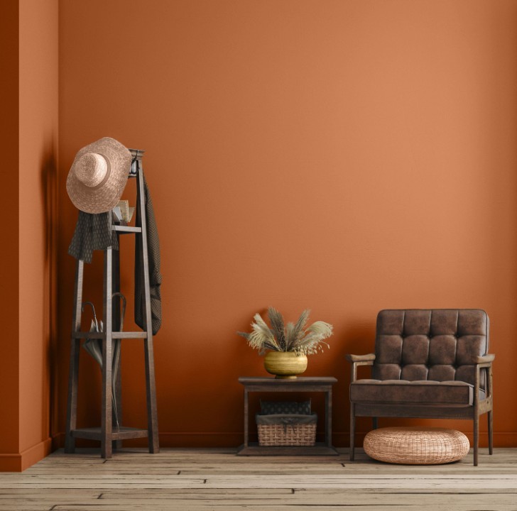
Orange is often the “black sheep” of the interior design world—frequently misunderstood and occasionally feared. However, it is arguably the most potent color for boosting mood, radiating warmth, and projecting confidence. In this comprehensive guide, we will explore the science of the orange color palette, what colors match with orange, and how to implement these schemes in every room of your house with professional precision.
The Psychology of Orange – Why Now?
Before diving into the “how,” we must understand the “why.” In color psychology, orange combines the physical energy of red with the cheerfulness of yellow. It is the color of the sunset, the harvest, and firelight.
- Warmth: It creates a cozy, inviting atmosphere.
- Confidence: It is a “social” color that encourages conversation.
- Vitality: It stimulates the mind and, interestingly, the appetite.
When you are stuck indoors, orange acts as a surrogate for sunlight. It bridges the gap between the outdoors and your living room, making it the perfect choice for a post-pandemic refresh.
Mastering the Color Palette
To avoid a “neon disaster,” you must understand the color wheel. Professional designers don’t guess; they use mathematical relationships between hues.
The Analogous Approach (Harmony)
This involves choosing colors sitting next to each other on the wheel. For orange, these are Red and Yellow. This creates a high-energy, “sunset” feel that is naturally pleasing to the human eye.
The Complementary Approach (Contrast)
The color directly opposite orange on the wheel is Blue. This is a classic “high-contrast” pair. Because blue is cool and orange is warm, they balance each other’s intensity.
The Monochromatic & Tonal Approach
You can stay within the orange family by using different saturations. Think of a gradient:
- Apricot/Peach (Light)
- Tangerine (Mid-tone)
- Burnt Orange/Terracotta (Deep/Earth)
Why Orange Is More Sophisticated Than You Think
Orange has long suffered from an unfair reputation. Too loud. Too playful. Too risky. For years, it has been relegated to children’s rooms, seasonal décor, or novelty accents that feel fleeting rather than intentional. But when used with knowledge, restraint, and the right companions, orange becomes one of the most expressive, versatile, and emotionally powerful colors in interior design.
What makes orange unique is its emotional duality. It is warm without being passive, energetic without being frantic, and bold without needing to dominate. Unlike red, which can feel aggressive, or yellow, which can feel overwhelming, orange sits comfortably in the middle ground—inviting, optimistic, and deeply human. It has the rare ability to energize a space while simultaneously making it feel lived-in and comforting.
The secret to using orange successfully has never been about the color itself. It has always been about context. Orange behaves differently depending on its saturation, its temperature, and—most importantly—the colors that surround it. This is why pairing orange thoughtfully is not optional; it is essential.
The seven pairings explored above are not trends pulled from a seasonal forecast. They are design relationships grounded in psychology, balance, and long-term livability. Each pairing tells a different story, evokes a different mood, and serves a different type of space. Understanding these stories is what separates accidental color use from intentional design.
Understanding Orange Beyond the Surface
Before choosing a pairing, it’s worth understanding that “orange” is not a single color. It exists on a wide spectrum:
- Burnt orange feels mature, earthy, and architectural
- Terracotta feels grounded, artisanal, and timeless
- Rust feels industrial and weathered
- Peach feels soft, luminous, and romantic
- Tangerine feels energetic and modern
- Amber feels luxurious and moody
Each of these behaves differently when placed next to other hues. Treating orange as a single entity is the most common mistake people make—and often the reason they feel unsure or dissatisfied with the result.
The pairings discussed earlier work because they account for this nuance. They allow orange to play different roles: hero, supporting actor, or subtle accent.
Design Pairings Revisited: What They Really Communicate
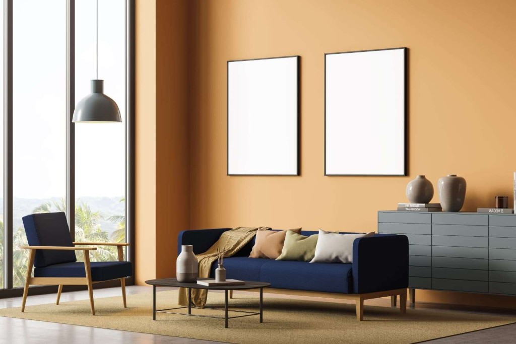
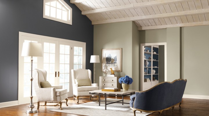
Orange and Navy Blue: Confidence Without Chaos
This pairing works because it balances extroversion with control. Navy blue grounds orange, giving it a sense of discipline and maturity. Together, they feel intelligent rather than flashy.
This combination is particularly effective in:
- Home offices
- Libraries
- Formal living rooms
- Corporate interiors
It communicates authority, clarity, and quiet confidence. The orange becomes a strategic highlight rather than a distraction. Think of it as a tailored suit with a silk pocket square—memorable, but never loud.
Orange and Sage Green: A Return to Nature
This pairing feels instinctively right because it mirrors the natural world. There is nothing forced about it. Sage green softens orange, while orange adds warmth to green’s calm restraint.
This duo excels in:
- Open-plan living areas
- Bedrooms
- Wellness spaces
- Homes leaning toward biophilic design
It replaces the cold minimalism that has dominated interiors for years with something more human and restorative. This combination doesn’t demand attention—it earns trust.
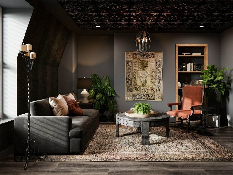
Orange and Black or Charcoal: Precision and Edge
This is where orange becomes architectural. Against black or charcoal, orange feels intentional and powerful, almost graphic. The contrast is high, but when handled carefully, it never feels chaotic.
Ideal for:
- Industrial lofts
- Modern kitchens
- Creative studios
- Masculine interiors
Here, orange functions like a spotlight. It directs the eye, defines zones, and adds tension that keeps a space visually interesting.
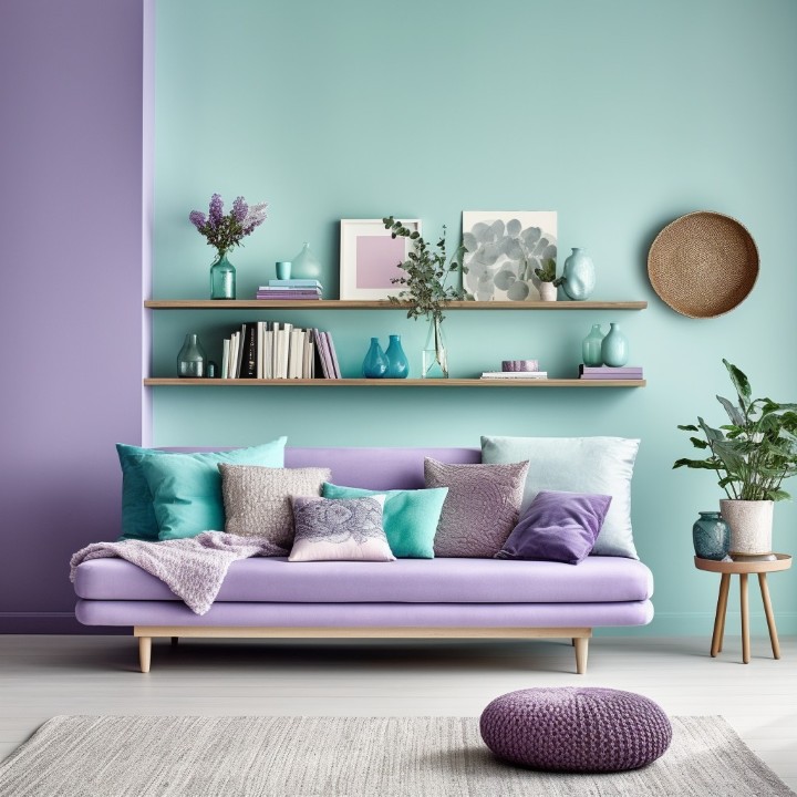
Orange and Dusty Pink: Soft Luxury
This pairing challenges outdated gendered ideas about color. When muted, both orange and pink lose their sweetness and gain sophistication.
Perfect for:
- Bedrooms
- Boutique hotels
- Mediterranean or bohemian interiors
- Relaxed yet elegant living spaces
The result is warm, romantic, and layered—never juvenile. This combination works especially well when paired with textured materials like plaster, linen, or aged wood.
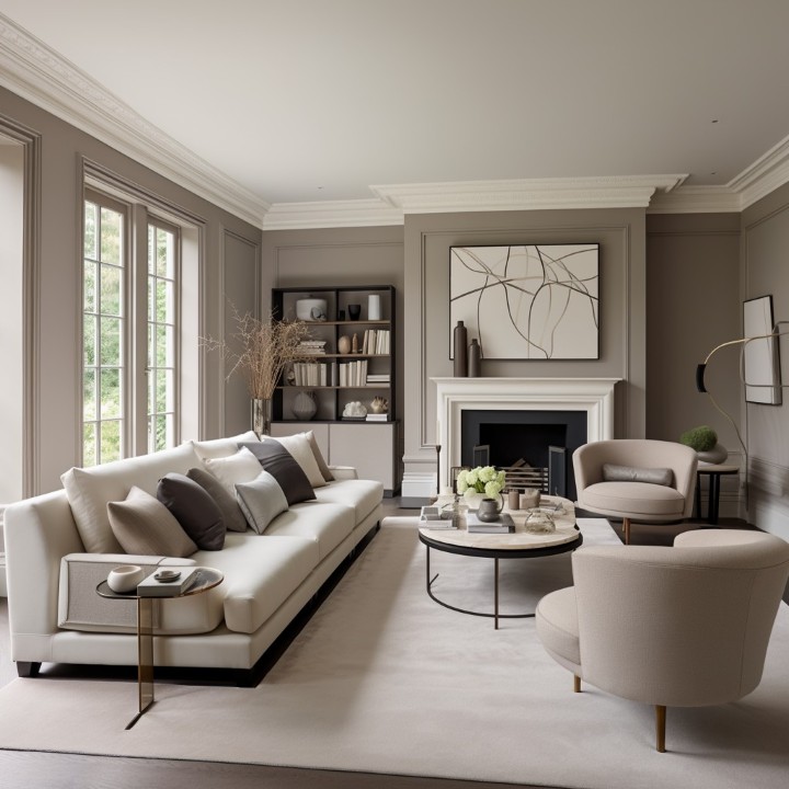
Orange and Beige or Cream: The Safe, Smart Choice
This pairing proves that orange does not need drama to be effective. Against soft neutrals, orange becomes an accent of warmth and personality.
Best used in:
- Rental properties
- Transitional interiors
- Scandinavian-inspired homes
- Spaces designed for longevity
If you want to introduce color without committing to bold walls or large furniture pieces, this is the most forgiving and timeless approach.
Orange and Sun-Yellow: Optimism Amplified
This is a joyful pairing that thrives on light. When balanced correctly, it creates spaces that feel alive and uplifting rather than overwhelming.
Works beautifully in:
- Kitchens
- Breakfast nooks
- Sunrooms
- Creative spaces
The key here is restraint. Use softer oranges and yellows, and let white or light wood act as a buffer.
Orange and Teal or Purple: Artistic Confidence
This pairing is unapologetic. It signals creativity, individuality, and a willingness to experiment.
Ideal for:
- Maximalist interiors
- Artistic homes
- Statement rooms
- Eclectic design lovers
When done well, it feels layered and curated, not chaotic. The richness of jewel tones elevates orange, making it feel luxurious rather than playful.
Practical Recommendations for Using Orange Successfully
-
Decide the Role of Orange First
Before choosing a pairing, ask yourself:
- Is orange the main feature?
- Is it a supporting accent?
- Is it a subtle undertone?
This decision should come before selecting furniture, paint, or décor. Orange used as a lead color requires different pairings and proportions than orange used sparingly.
-
Control Saturation, Not Just Quantity
A small amount of highly saturated orange can feel louder than a large amount of muted terracotta. Always consider intensity before scale.
If you’re hesitant:
- Start with burnt or dusty tones
- Avoid neon or overly bright oranges
- Let texture soften the color’s impact
-
Let Materials Do the Heavy Lifting
Orange looks dramatically different depending on the material:
- Velvet adds richness
- Linen softens the tone
- Leather adds warmth and masculinity
- Clay and ceramic feel artisanal
Often, the success of an orange pairing has less to do with color theory and more to do with material choice.
-
Balance With Negative Space
Orange needs breathing room. White walls, light flooring, or neutral ceilings allow orange to shine without overwhelming the eye.
Think in terms of rhythm rather than repetition.
-
Test in Natural and Artificial Light
Orange is highly reactive to lighting. What looks warm and inviting in daylight may feel heavy under warm artificial light at night.
Always test samples at different times of day before committing.
Designing With Confidence, Not Fear
Orange is not a “dangerous” color. It is a misunderstood one. When approached thoughtfully, it becomes one of the most rewarding hues to work with—capable of transforming sterile rooms into inviting spaces, and ordinary interiors into expressive environments.
The seven pairings outlined here offer a framework, not a rulebook. They are starting points grounded in proven design principles, but the best interiors always come from adaptation, not imitation. Your home should reflect your personality, your habits, and your emotional needs—not just a color trend.
If there is one guiding principle to remember, it is this:
- Orange works best when it is given purpose.
When orange is intentional, supported, and thoughtfully paired, it does not shout. It speaks—warmly, confidently, and with lasting impact.
Room-by-Room Implementation Strategy
The Kitchen: The Heart of the Home
Why: Orange stimulates the appetite and makes the morning coffee feel more “awake.”
How: Consider an orange tiled backsplash or orange bar stools against a white or grey kitchen island.
The Dining Room: Appetite and Conversation
Why: It encourages guests to talk and enjoy their food.
How: A terracotta-colored rug or orange linen napkins. Combine with dark wood furniture for a “Mid-Century Modern” look.
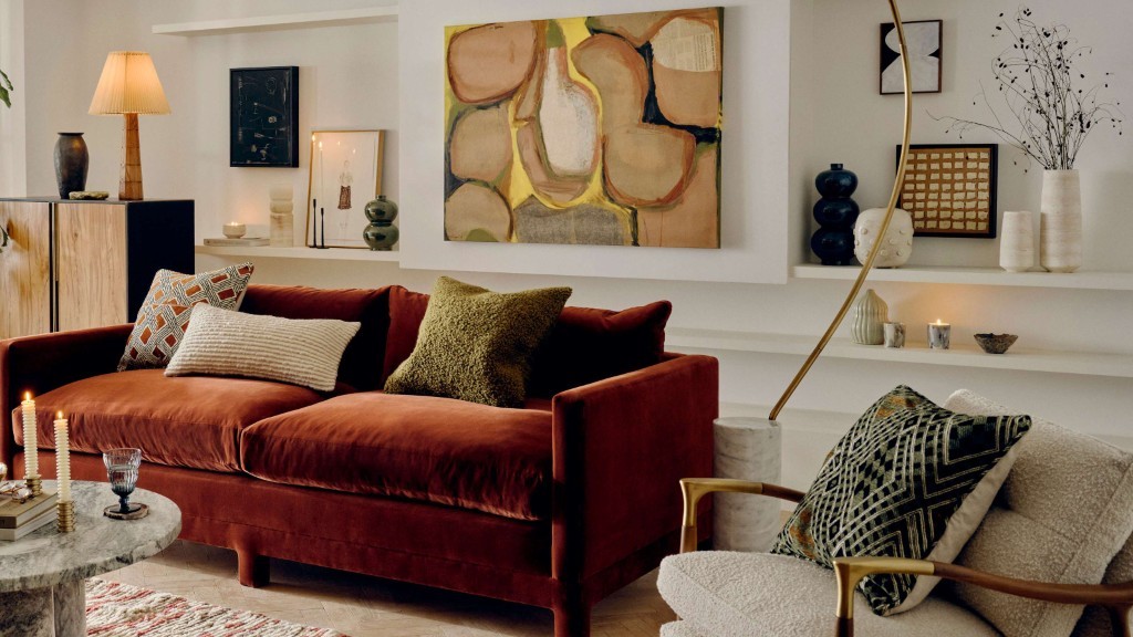
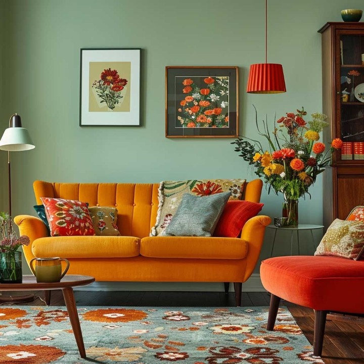
The Living Room: Warmth and Welcome
Why: To create a “hearth” feel even without a fireplace.
How: A “feature wall” in a burnt orange shade, paired with cream curtains and green indoor plants.
The Bedroom: Restful Vibrance
Why: To ensure you wake up in a good mood.
How: Avoid “Electric Orange” here. Instead, go for “Peach” or “Apricot” walls, which provide a soft glow in the morning light.
Cost Analysis and Solutions
Redecorating requires a budget. Here is a breakdown of what you can expect to spend to “Orange-ify” your home.
Estimated Costs for DIY vs. Professional (2026 Estimates)
| Item | DIY Cost Range | Professional Cost Range | Solution |
| Interior Paint (per room) | $100 – $250 | $400 – $1,200 | Best for a total mood overhaul. |
| Accent Pillows/Textiles | $50 – $150 | $200 – $500 | Low risk; easy to swap if you change your mind. |
| Area Rugs | $150 – $600 | $800 – $3,000 | Defines the space and grounds the orange color. |
| Feature Wallpaper | $100 – $300 | $500 – $1,500 | Adds texture and pattern alongside the color. |
| Lighting (Orange Glass) | $80 – $200 | $300 – $700 | Changes the “temperature” of the room at night. |
Overcoming the “Tricky” Reputation
Many designers avoid orange because it has a high “metamerism” rate—meaning it looks very different under LED light than it does under sunlight.
The Solution:
- The 60-30-10 Rule: Use 60% of a neutral color (White/Beige), 30% of a secondary color (Blue/Green), and only 10% of the Bold Orange.
- Test Your Swatches: Always paint a 2ft x 2ft square on your wall and watch it change from morning to evening before committing to the whole room.
Conclusion: Why Orange Truly Wins in 2026
Redecorating has always been framed as a visual decision—an exercise in taste, trends, and personal style. But as we step deeper into 2026, it has become increasingly clear that the spaces we live in are no longer just backdrops to our lives. They actively shape our emotions, energy levels, productivity, and sense of safety. Color, more than furniture or layout, plays a central role in this quiet psychological influence. And among all colors reclaiming relevance this year, orange stands apart—not as a fleeting trend, but as a statement of emotional resilience.
Orange is not a passive color. It does not sit quietly in the background or fade politely into neutrality. It shows up. It speaks. It energizes. In a post-pandemic world where people crave warmth without chaos, stimulation without stress, and optimism without artificial gloss, orange delivers something few colors can: balanced vitality.
What makes orange especially powerful in 2026 is its adaptability. It is no longer confined to retro throwbacks or bold bohemian spaces. Today’s orange is nuanced, layered, and intelligent. It can be soft like peach dusted with light, earthy like terracotta baked by the sun, or sophisticated like burnt amber glowing under warm lighting. This versatility allows orange to work across a spectrum of interiors—from minimalist apartments to traditional homes, from creative studios to family kitchens.
Emotionally, orange sits at the intersection of comfort and confidence. It borrows the warmth and security of red but sheds its aggression. It inherits the cheerfulness of yellow but avoids its restlessness. The result is a color that feels encouraging rather than demanding, uplifting without overwhelming. In uncertain times, this emotional middle ground is precisely what modern homes need.
Pairing orange with the right complementary colors is where its true magic unfolds. When grounded by navy blue, orange becomes disciplined and professional—ideal for home offices or study spaces where creativity must coexist with focus. When paired with green, especially olive or sage, orange reconnects us to nature, evoking earth, growth, and renewal. When softened with pink, blush, or muted rose, orange becomes tender and approachable, perfect for bedrooms and personal spaces that prioritize calm connection over stimulation.
These combinations are not arbitrary. They reflect how people want to feel in their homes now: energized but not anxious, expressive but not chaotic, grounded yet hopeful. Orange supports this emotional architecture better than almost any other hue.
Perhaps most importantly, orange invites participation. It encourages you to live in your space rather than merely look at it. A pumpkin-toned kitchen feels welcoming, not museum-like. A burnt orange rug feels forgiving under daily foot traffic. Peach cushions invite you to sit, relax, and stay awhile. Orange does not ask you to preserve perfection; it celebrates real life.
You may not notice it immediately, but once orange enters a space, something subtle shifts. Conversations linger longer. Mornings feel less sluggish. Evenings feel warmer, more intimate. This is the quiet power of color psychology at work—not as a theory, but as lived experience.
You have already spent countless hours inside your home. In 2026, the question is no longer whether your space looks good—but whether it supports who you are becoming. Orange, in all its warmth and adaptability, answers that question with confidence.
Detailed Recommendations for Using Orange Successfully
-
For Small Spaces: Let Light Lead the Way
Small spaces demand sensitivity. Color choices that feel expansive in large rooms can quickly feel oppressive when square footage is limited. This is where lighter shades of orange—peach, apricot, coral, and soft melon—become invaluable.
These hues reflect light rather than absorbing it, creating an illusion of openness while still providing warmth. Unlike stark whites, which can feel clinical, or cool greys, which may flatten a room emotionally, soft oranges add dimension without visual weight. They wrap a small room in comfort rather than compressing it.
In studio apartments, compact bedrooms, or narrow hallways, peach-toned walls or decor elements can subtly enhance natural light, especially during morning hours. Coral accents work beautifully in bathrooms and kitchens, where they counterbalance hard surfaces like tile, glass, and metal.
Dark oranges—such as rust or deep burnt amber—should be used sparingly in small spaces. If you love these tones, incorporate them through accent pieces rather than dominant surfaces: a framed print, a single armchair, a ceramic vase, or a patterned cushion. This approach preserves depth without closing the room in.
The key principle here is airiness with warmth. Small spaces do not need to feel neutral to feel open—they need to feel intentional.
-
For High-Traffic Areas: Choose Depth Over Delicacy
High-traffic areas—living rooms, entryways, dining zones, family spaces—require colors that can withstand both physical wear and visual fatigue. This is where burnt orange truly excels.
Unlike lighter shades that show stains, fading, or scuffing quickly, deeper orange tones age gracefully. They camouflage minor imperfections, hide everyday wear, and maintain richness over time. A burnt orange rug, for example, can anchor a living room while remaining forgiving of spills, pet hair, or heavy foot traffic.
In upholstery, burnt orange strikes a rare balance: it feels bold but not loud, warm but not dated. Sofas or armchairs in this shade develop character rather than looking tired as years pass. The color absorbs life rather than resisting it.
For entryways, orange can set an immediate emotional tone. A terracotta bench, an amber-toned runner, or even an orange-hued artwork signals warmth and hospitality the moment someone walks in. It says, this home is lived in, not staged.
In dining areas, orange subtly stimulates appetite and conversation—a trait long recognized in hospitality design. When used thoughtfully, it enhances social energy without becoming distracting.
Durability, both visual and practical, is what makes burnt orange such a smart investment for active homes.
-
Lighting Matters More Than You Think
Lighting is the silent partner in any color decision, and with orange, it is absolutely decisive. The wrong lighting can flatten orange, making it appear muddy or dull. The right lighting, however, allows it to glow.
Warm White bulbs (around 2700K) are the gold standard when working with orange decor. They enhance the natural warmth of the color, creating a soft, inviting atmosphere that feels organic and lived-in. Under warm lighting, orange gains depth, subtle variation, and richness.
Cool White lighting, by contrast, strips orange of its warmth. It can make even the most beautiful terracotta look lifeless or brownish. This is especially noticeable in the evenings, when artificial lighting dominates.
Layered lighting further elevates orange interiors. Combining ambient lighting with table lamps, floor lamps, or wall sconces allows orange elements to shift in tone throughout the day. Morning light may highlight its freshness; evening light reveals its coziness.
In kitchens and workspaces, balance is key. Use warm overhead lighting paired with focused task lights to maintain clarity without sacrificing atmosphere.
Think of lighting not as an accessory, but as a translator—it determines how your chosen orange speaks to the room.
-
Start Small, Then Build Confidence
One of the most common mistakes in redecorating is believing that transformation requires immediate, dramatic change. Orange works best when introduced gradually and intentionally.
Begin with textiles—cushions, throws, curtains, or rugs. These elements are low-commitment yet highly impactful. Notice how the color affects your mood throughout the day. Pay attention to how it interacts with existing furniture, flooring, and natural light.
From there, expand thoughtfully. Perhaps an accent chair. A statement artwork. A painted niche or cabinet interior. Over time, your comfort with the color grows, and the space evolves organically rather than abruptly.
This slow layering approach results in interiors that feel personal, curated, and emotionally aligned—never forced.
-
Let Orange Reflect Your Life, Not Just Trends
Trends come and go, but homes endure. The reason orange resonates so strongly in 2026 is not because it is fashionable—but because it reflects how people want to live now.
Orange symbolizes forward movement without denial of the past. It honors warmth, creativity, and resilience. It does not pretend everything is perfect; it celebrates progress anyway.
When you choose orange, you are not just choosing a color. You are choosing to create a space that supports energy, connection, and emotional well-being. Whether that choice shows up as a single coral cushion or an entire pumpkin-toned kitchen, the intention matters more than the scale.
You have already invested time, effort, and care into your home. Let the colors you choose return that care—quietly, daily, and without asking for attention.
In 2026, orange doesn’t shout.
It welcomes, energizes, and stays.