Defining the Enigma of Taupe
Derived from the French noun, the term taupe color refers to a sophisticated type of dark brown infused with a distinct grayish hint. Because it sits perfectly on the fence between two primary neutrals, you can effectively describe taupe as either a grayish-brown or a brownish-gray. It is a delightfully vague color, often making it difficult for the untrained eye to determine whether they are looking at a cool gray or a warm brown.
The etymology of the word is as grounded as the color itself. The original term stems from the Latin talpa, and both the French and Latin roots refer to the same creature: the “mole.” Initially, the term was strictly used to describe the specific fur color range of the French mole. However, since the 1940s, the definition began to expand, encompassing a much wider range of shades and intensities. While the term allegedly first emerged in the early 19th century, the Oxford English Dictionary officially solidified its status by including an entry for taupe color as early as 1911.
The Taupe vs. Tan Debate: A Designer’s Challenge
Due to its expansive range of shades, taupe and tan are frequently mistaken for one another. Even professionals who work with color daily—such as interior designers, architects, and fine artists—often struggle to reach a consensus on what actually constitutes a “true” taupe.
This ambiguity is exactly what makes the color so valuable in design. It is a “chameleon” hue that shifts based on the lighting and the colors surrounding it. While tan is strictly a pale brown with yellow or reddish undertones, taupe introduces a level of complexity by bringing in desaturated cool tones.
A Taxonomy of Taupe: Exploring Its Many Variations
To master this color, one must understand its diverse family tree. The various iterations of taupe allow it to fit into almost any design style, from rustic farmhouse to ultra-modern minimalism.
- Pale Taupe: This refers to the original hue of a mouse. Its first recorded use as a color name in the English language dates back to 1606.
- Light Taupe (Dark Tan): Often labeled simply as “taupe” in art supplies like colored pencils, this shade leans more toward a sophisticated tan.
- Mauve Taupe: Introduced in 1925, this variation adds a purple or lavender undertone, making it a favorite for romantic and vintage-inspired interiors.
- Rose Taupe: Emerging in 1924, this shade incorporates pinkish hues, creating a warm, fleshy tone that feels both organic and luxurious.
- Sandy Taupe (Taupe Sand): A lighter, airier version that mimics the look of wet sand at dusk.
- Taupe Brown (Medium Taupe): This is a shade of tan so deep and saturated that it becomes nearly indistinguishable from chocolate brown.
- Taupe Gray and Deep Taupe: These versions prioritize the charcoal and slate elements of the mix, offering a moodier, more architectural feel.
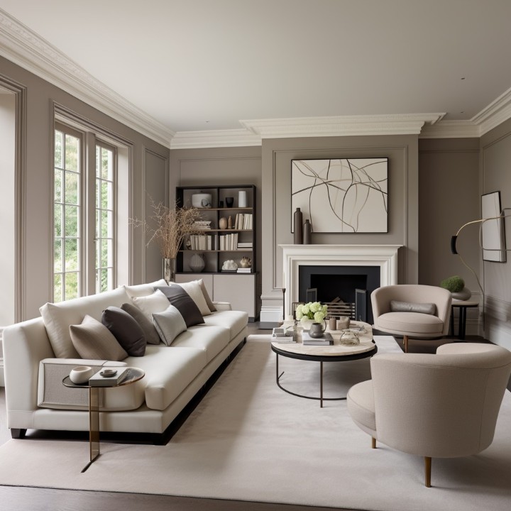
Why Taupe is the Designer’s “Secret Weapon”
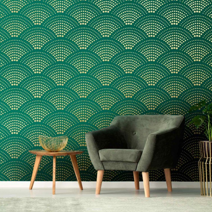
Taupe is frequently grouped with colors like chartreuse and indigo—shades that people find incredibly hard to pinpoint but impossible to ignore. Tonally speaking, taupe is exceptionally neutral, which grants it a dual purpose: it acts as a rock-solid base color for large surfaces (like walls) and as a subtle, elegant accent color for furniture and accessories.
Understanding which colors go with taupe is the key to unlocking its potential. Because it contains both warm and cool elements, it can bridge the gap between disparate design elements. Let’s explore 18 ways this color can be applied to transform a home.
18 Expert Applications of Taupe in Interior Design
-
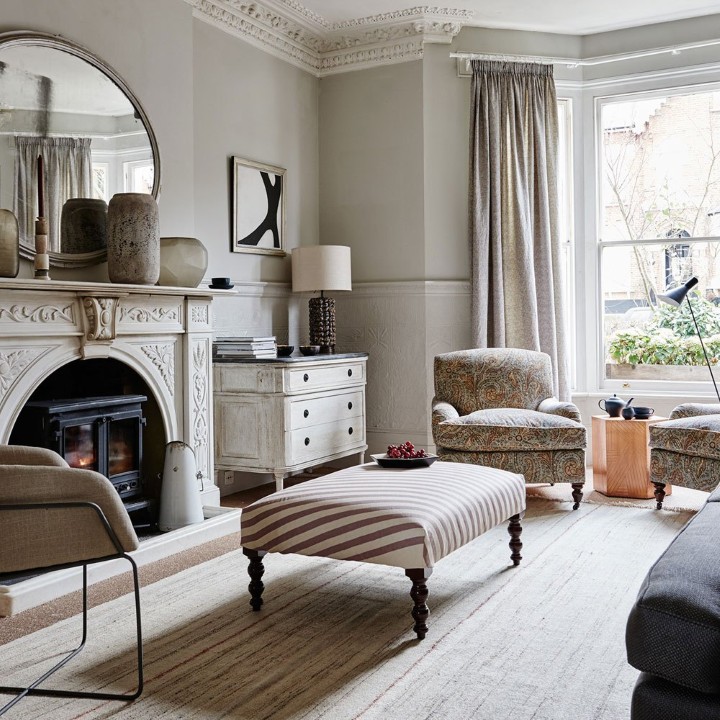
The Elegance of Taupe Curtains
Curtains, particularly those made of plush materials like velvet or heavy linen, look spectacular in taupe. Because taupe is a mid-tone, it creates a bold statement piece that frames a window without overwhelming the room. It possesses a feminine softness that tones down harsher architectural lines.
-
Walls and Golden Cream Pairing
One of the most seamless color pairings is taupe and golden cream. By using taupe as the primary wall color, you create a sophisticated backdrop. When you introduce golden cream through trim, crown molding, or ceiling paint, the warmth of the cream pulls the brown out of the taupe, creating a glow that feels high-end and inviting.
-
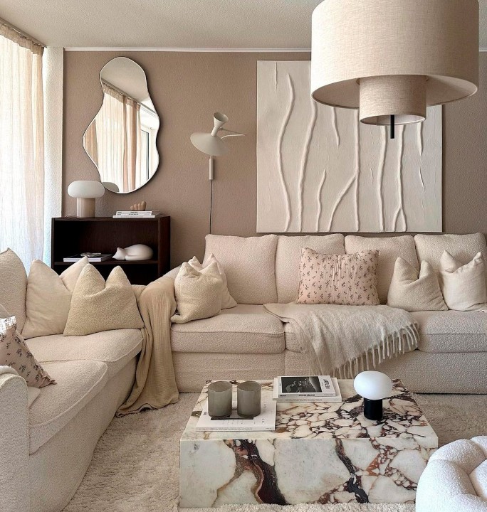
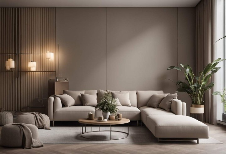
Romantic Living Room Sofas
A taupe sofa is a brilliant investment. Unlike white sofas, they hide minor wear and tear, and unlike black sofas, they don’t feel heavy. Pairing a taupe sofa with coordinating throw pillows creates a mysterious, romantic atmosphere that feels grounded and cozy.
-
Ivory Finishes and Cool Undertones
A room draped in ivory can sometimes feel too stark or “floaty.” Finishing the space with taupe accents—such as a rug or a coffee table—results in a cooling effect that grounds the ivory, making the entire space look balanced and intentional.
-
The Bold Plum Partnership
If you are looking for a high-contrast companion, plum is one of the best colors to pair with taupe. The deep purple tones of plum resonate with the subtle lavender undertones found in many taupe shades, creating a royal and sophisticated palette.
-
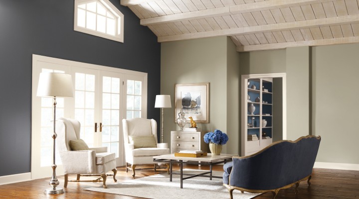
The Victorian Master Bedroom
To achieve a classic Victorian theme, combine taupe with traditional grays and heavy creams. This trio creates a sense of history and depth, especially when used with textured wallpapers or ornate wooden furniture.
-
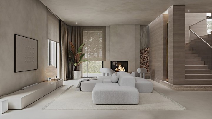
Monochromatic Shade Variations
Because taupe has such a wide range, you can design an entire room using nothing but taupe. By mixing light “sandy” taupe with “deep” taupe gray, you create a mesmerizing, layered effect that feels architectural and modern.
-
A Sophisticated Nursery
Taupe is the ultimate gender-neutral color for a nursery. It provides a calming environment for a baby and allows you to add pops of color (like mint green or soft coral) as the child grows without needing to repaint the walls.
-
Golden Accent in Furniture
A light taupe sofa or armchair creates a stunning visual when placed in a room with golden accents. Whether it’s gold leaf frames or a sun-drenched yellow wall, the taupe acts as a cooling agent that prevents the gold from looking gaudy.
-
The Luxury Bathroom
For a bathroom that feels like a five-star spa, pair a crystal chandelier with taupe cabinetry and tiles. The light from the crystals reflects off the taupe surfaces, creating a luxurious, feminine glow that is far more interesting than standard white tile.
-
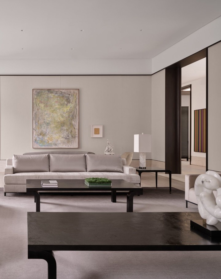
The Compelling Home Office
Many people default to gray or white for their home office, but these can feel sterile. Taupe creates a scene that is more compelling and focused. It provides enough warmth to keep you comfortable during long hours but enough neutrality to prevent distraction.
-
Taupe as a Subduing Undertone
If a room feels “too gray” or “too cold,” taupe can be used as an undertone to subdue the harshness. It adds just enough brown to “warm up” a slate-gray room without turning it completely beige.
-
Creating a Color “Pop”
While taupe is a neutral, it can actually make other colors “pop.” When surrounded by taupe, a bright turquoise or a vibrant orange looks sharper and cleaner than it would against a white background.
-
The Warm Bedroom Den
Turn your bedroom into a comfortable den by adding taupe accents through bedding and upholstery. It creates a cocoon-like effect that is conducive to sleep and relaxation.
-
Perfecting Traditional Settings
If you are aiming for a traditional or “Old World” theme, taupe is the perfect bridge. It complements heavy antiques and dark wood stains perfectly, providing a bridge between the dark furniture and the light ceiling.
-
Framing the Reading Nook
In a library or reading nook, taupe curtains can frame a window to create a sense of romance and quietude. It helps muffle sound and creates a visual boundary that signals a place for rest.
-
The Contemporary Minimalist Theme
For a contemporary look, pair taupe finishes with crisp white walls. This creates a simplistic, high-contrast effect that feels fresh and airy without being boring.
-
Taupe as a Foundation
Taupe walls act as a perfect foundation for almost any art collection. Because it is neither too bright nor too dark, it allows the colors in your paintings and photographs to shine without competing for attention.
Navigating Color Psychology and Interior Design
Before selecting a color combination, you must understand the psychological impact of your choices. Some colors are inherently “cool,” providing a sense of cleanliness and efficiency. Others give off an ambiance that is “warm” and inviting.
Taupe is unique because it belongs to both categories depending on its execution. It is the ultimate design challenge. First, you must identify its nature: is it more gray or more brown? Once you understand the undertone, you can begin to pair it effectively. Modern definitions of taupe have expanded to encompass:
- Warm grays with “greige” tendencies.
- Browns with subtle lavender or violet hints.
- Mixes of gray and brown with soft pastels like sage green, pale yellow, or dusty pink.
Taupe vs. Greige: Knowing the Difference
Many people confuse taupe with “greige.” While they are cousins, they are not the same. Greige is a combination of gray and beige, which typically results in a lighter, cooler, and simpler neutral. Taupe is much deeper and more complex, often carrying heavier brown or purple undertones that greige lacks.
Strategic Categorization: Choosing Your Desired Result
To find the perfect color palette, you must start with the end in mind. Here are four focused directions for using taupe:
-
The Warm and Inviting Option
If you want a space that feels cozy, choose a taupe that leans toward the tan-brown range. These warmer hues pair beautifully with:
- Olive Tints: For an earthy, natural feel.
- Dusty Pink: For a soft, romantic touch.
Muted Yellow: For a sun-drenched, cheerful atmosphere. Using warm taupe on large surfaces like sofas or walls, and pairing them with natural wood furniture, creates a harmonious, organic environment.
-
The Cool and Refreshing Option
If you want your room to feel crisp and revitalizing, choose a “grayer” taupe with hints of blue or green. This version of taupe works perfectly with:
- Pale Lavender: To bring out the violet undertones.
- Sky Blue: For a coastal, breezy aesthetic.
Mint Green: For a vintage, “cottage-core” feel. Pairing these with white-painted furniture creates a refreshing, clean look that is perfect for kitchens or sunrooms.
-
The Neutral and Modern Option
For an ultra-modern, high-tech feel, mix taupe with industrial materials. Cool taupe palettes (with blue-gray tints) look incredible when paired with:
- Chrome and Stainless Steel: The metal reflects the cool tones of the paint.
- Black Leather: For a sophisticated, masculine home office.
- Glass: To keep the space feeling open and futuristic.
-
The Bold and Dramatic Option
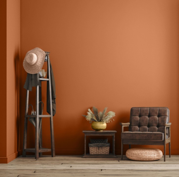
Taupe doesn’t always have to be “safe.” To go bold, avoid the medium shades and go for the extremes—either a very deep, chocolatey taupe or a very pale, almost-white taupe. Avoid pastels and instead pair your taupe with “saturated” colors like:
- Teal or Peacock Blue
- Pumpkin Orange
- Mustard Yellow
Coral or Terracotta Use unique patterns like bold stripes or large florals in these colors against a neutral taupe background to create a clean, sharp “pop” that doesn’t feel cluttered.
Final Word: The Versatility of Taupe
By now, you likely realize that despite being a “troublesome” and vague color, taupe is an incredibly dependable decorative element. Finding the right colors to go with taupe is not an arduous journey; it is an exploration of your own taste.
Neutrality and versatility are the two most reliable qualities this color offers. Whether you are looking for an inexpensive way to refresh your bathroom or a sophisticated foundation for a traditional living room, taupe is the answer. It bridges the gap between the starkness of black and white and the overwhelming nature of bright colors.
By dedicating the time to research the various shades and undertones of taupe, you will discover a hue that speaks to you on a personal level. Your home is your sanctuary, and with the right application of taupe, you can create a space that is as intimate as it is beautiful.