The Transformative Power of Color
If you are bored with the same repetitive color schemes in your home, you are not alone. Many homeowners find themselves stuck in a cycle of “safe” neutrals—beiges and grays that eventually lead to a sense of aesthetic fatigue. Replacing these with more attractive, intentional color schemes can fundamentally alter your home’s atmosphere.
Changing a room’s color scheme is perhaps the most cost-effective way to make your home feel brand new. It affects your mood, your productivity, and even your quality of sleep. However, not everyone can easily look for color schemes that fit their specific architectural style or lighting conditions. Choosing a palette requires a balance of intuition and design theory.
To help you navigate this creative journey, we have curated a comprehensive list of the best color schemes for 2026. Whether you are looking to refresh your social living room, create a sanctuary in your master bedroom, or add a spark of energy to your kitchen, these professional palettes provide the perfect roadmap.
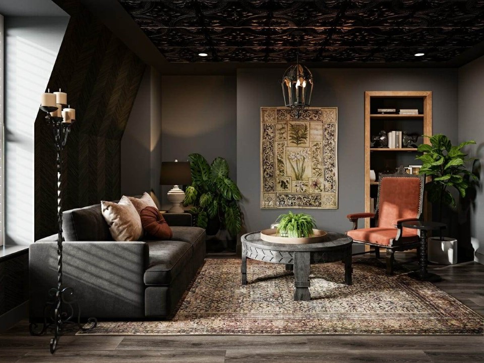
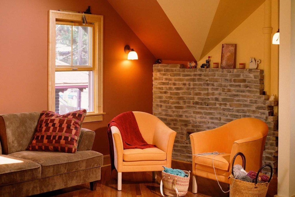
Living Room Color Schemes – Setting the Social Stage
The living room is the heart of the home. It is where you host guests, relax after a long day, and express your primary design personality. If you are getting bored with the current look of your living area, try to change the atmosphere by experimenting with depth, saturation, and tone. Here are the top three color schemes you can copy right now:
-
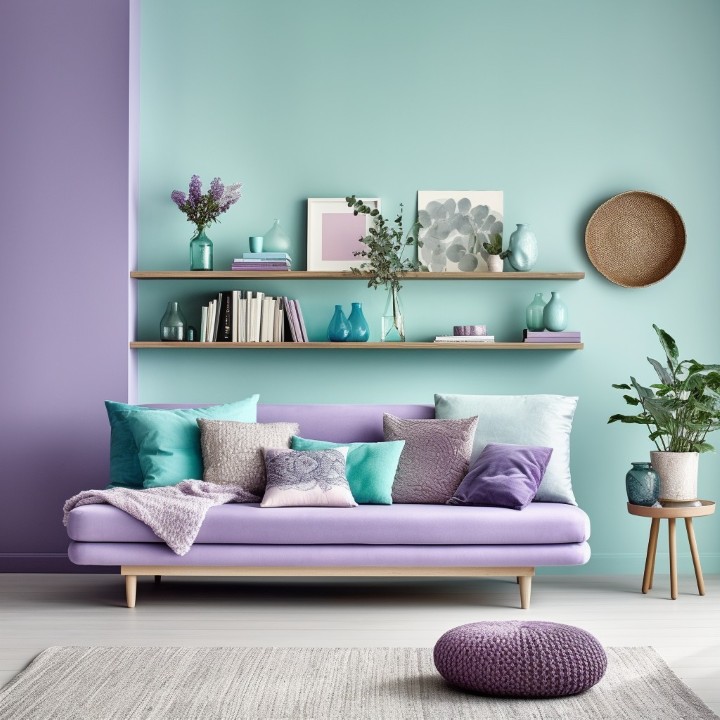
Lilac: The New Neutral of Luxury
Lilac is a sophisticated, calm color with a gentle touch of purple. While purple can sometimes feel overwhelming, lilac has gray undertones that make it surprisingly versatile. It is an ideal choice for those who want a luxurious and classic living room style without the heaviness of traditional royal hues.
- Complementary Accents: To elevate lilac, combine it with furniture that features a touch of gold or brushed brass. The warmth of the gold cuts through the coolness of the lilac, creating a balanced, high-end feel.
- Balancing with White: To ensure the room remains airy, combine lilac with a crisp, clean white. Using white on the crown molding or baseboards creates a “frame” for the lilac walls, resulting in a soothing living room with a soft, ethereal glow.
- Why It Works: Lilac is a unique room color scheme because it is rarely applied in mainstream suburban homes. Choosing it ensures your living room stands out as a unique architectural statement.
-
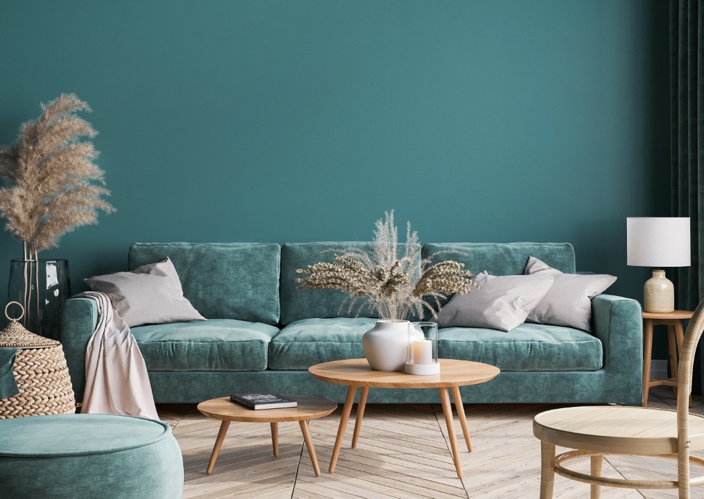
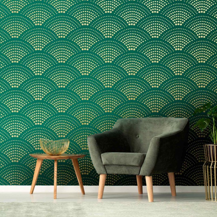
Mint Green: Tropical Elegance
If you want a living room that feels like a perpetual vacation, mint green is the solution. Mint green beautifully stretches from the ceiling to the walls, creating an “enveloping” effect that is both elegant and refreshing. When paired with a diamond or crystal chandelier, a mint green ceiling reflects light in a way that feels watery and expensive.
- Furniture Coordination: A common mistake is using mint green for every piece of furniture. Instead, choose your sofa in a cream or beige color. These warm neutrals ground the “coolness” of the mint and provide a soft place for the eye to rest.
- Atmosphere: This scheme provides a tropical feel that isn’t kitschy. It works best in rooms with plenty of natural light, which helps the green pigments look vibrant rather than “minty-gray.”
-
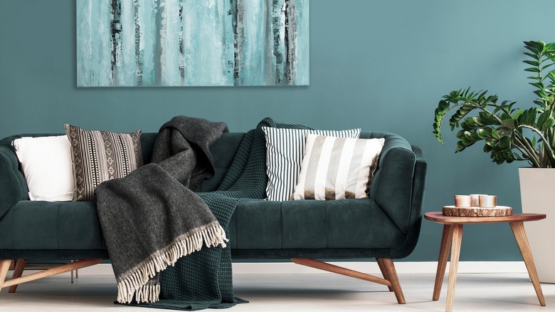
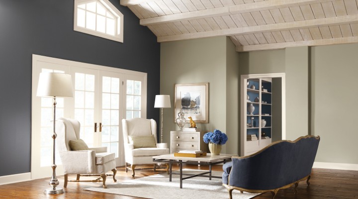
Navy Blue: The Modern Classic
Navy blue has moved from a “trend” to a “staple.” It is one of the colors that continues to dominate interior design because it provides a sense of security and depth. A living room with a navy blue palette provides a soothing and comfortable atmosphere that mimics the twilight sky.
- The Contrast Rule: Navy blue is easy to combine because it acts as a “dark neutral.” If you paint your walls in a deep navy, place a white sofa against them. The high contrast is instantly striking.
- Artistic Integration: You can also place large-scale paintings with predominantly white or silver colors on a navy wall. This creates a focal point that draws guests into the room, making the space feel curated and thoughtful.
Master Bedroom Color Schemes – Creating Your Sanctuary
Everyone needs a comfortable and beautiful master bedroom. This is your private retreat, and the color scheme here should prioritize relaxation and emotional restoration. Here are the best schemes to change the nuance of your master bedroom:
-
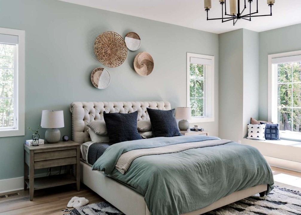
Ice Blue: The Refreshing Whisper
Ice blue is a subtle, almost-translucent color that is perfect for the master bedroom. It creates a refreshing atmosphere that mimics the feeling of a high-end spa. Because it is a “receding” color, it can actually make a small bedroom feel significantly larger.
- Elegance in Textiles: Put bed linen in shades of silver or charcoal to add to the elegance.
- Furniture Match: Add a white side table or a white upholstered headboard. The crispness of the white against the ice blue creates a “frosty” look that remains cozy through the use of soft textures like faux fur or high-thread-count cotton.
-
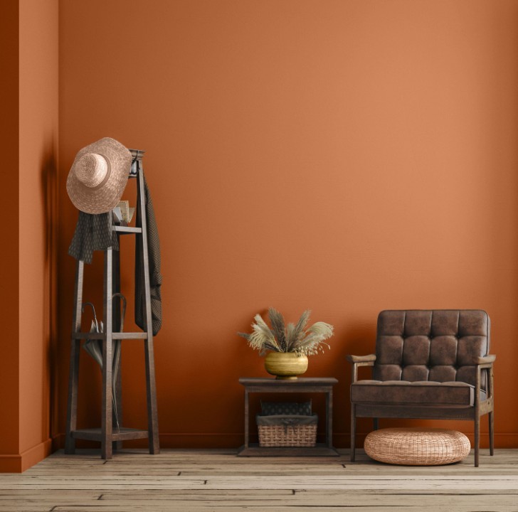
Terracotta: Earthy and Modern
If you are looking for a color that feels “grounded,” terracotta is the standout choice for 2026. It is close to brown but much brighter and more vibrant. Terracotta is capable of creating a comfortable atmosphere that feels warm and sunny even on cloudy days.
- Coordinating Palettes: You can easily match terracotta with other soft colors like beige or blush pink. These colors share the same warm undertones, creating a monochromatic flow that is very pleasing to the eye.
- Natural Elements: Combine terracotta walls with a bed frame that emphasizes natural wood elements. The grain of the wood complements the “clay” feel of the terracotta, making the room feel like a modern Mediterranean retreat.
-
Butter Yellow: The Sophisticated Glow
If you are bored with the “millennial pinks” or standard purples, try butter yellow. This is a pale, creamy yellow that avoids the “neon” trap. It feels like soft morning sunlight and is incredibly effective at lifting the mood of a room.
- Texture Pairing: Butter yellow looks magnificent when combined with wood or rattan furniture. It has an organic quality that lends itself to Boho-chic or classic styles.
- The Calming Effect: Combine butter yellow with clean white linens. This creates a “buttermilk” effect that is calming rather than overstimulating. It is a trending room color scheme that provides a “classic” feel without feeling dated.
Kitchen Color Schemes – The Culinary Canvas
The kitchen is no longer just a utility room; it is a social hub. Many people spend their time here cooking or making family favorite drinks, so the color scheme should be as inviting as the food being prepared.
-
Wine Red: Glamour and Appetite
If you want a kitchen with a glamorous, high-energy feel, wine red (or burgundy) is a daring and successful choice. Red is known to stimulate the appetite and conversation, making it a functional choice for a kitchen.
- Highlighting the Depth: Mix and match with white cabinetry or white marble countertops to highlight the richness of the red.
- The Luxury Factor: Wine red and white are popular schemes this year because they bridge the gap between “modern” and “traditional” luxury.
-
Dusty Pink: Subtle Sophistication
If your kitchen feels too dark or “heavy,” change the color to a calm but elegant dusty pink. Dusty pink is not “too feminine” because it contains gray and brown undertones. It provides a soothing concept that is cheerful without being distracting.
- The Neutral Bridge: Combine this color with black hardware or black granite counters. The black adds a “masculine” edge to the pink, making the kitchen feel balanced and modern. It also pairs effortlessly with beige, cream, or white.
-
Jade Green: The Splash of Life
Make your kitchen atmosphere more cheerful with a splashing color like jade green. This is a deep, jewel-toned green that represents health and vitality.
- Cabinetry Focus: Apply jade green to your kitchen cabinets. This looks particularly stunning when complemented by a black tile floor or dark wood accents.
- Visual Center: Combine jade green with white walls. This allows the cabinetry to be the undisputed center of attention, creating a “designer” look that feels expensive and unique.
-
Pistachio: Minimalist Peace
For those who prefer a more subdued, organic kitchen, pistachio green is a perfect choice. It is a light, nutty green that feels “clean.”
- Style Match: Pistachio is suitable for minimalist or Scandi-style kitchens.
- The Wood Connection: Mix and match this color with light wood elements, such as oak or ash. It creates a “farm-to-table” aesthetic that makes the kitchen feel fresh and healthy.
The Science of Color Coordination
Choosing the colors is only half the battle; knowing how to distribute them is the key to a professional result. Designers often use the 60-30-10 Rule:
- 60% (Primary Color): Usually the walls and large rugs.
- 30% (Secondary Color): Upholstery, curtains, and accent walls.
- 10% (Accent Color): Throw pillows, artwork, and small decor.
When applying the schemes mentioned above—like Lilac and Gold—the Lilac should occupy 60% of the space, a neutral like White should be 30%, and the Gold accents should be the final 10%.
The Role of Lighting in Your Color Scheme
A color scheme can look completely different depending on your lighting.
- North-Facing Rooms: Tend to have cool, bluish light. Use warmer schemes like Terracotta or Butter Yellow to prevent the room from feeling chilly.
- South-Facing Rooms: Have intense, warm light. These rooms can handle cooler colors like Navy Blue or Ice Blue beautifully.
- Artificial Light: LED bulbs come in different “temperatures.” If you choose a Mint Green scheme, use “Cool White” bulbs to keep the green looking crisp. If you choose Wine Red, use “Warm White” bulbs to enhance the richness of the color.
Recommendations for a Successful Room Refresh: A Professional Guide to Color, Comfort, and Cost
Refreshing a room does not always require a full renovation or a massive budget. In many cases, the most transformative changes come from thoughtful color choices, intentional design flow, and strategic investment in quality materials. Yet, many homeowners hesitate to begin because they fear making expensive mistakes or choosing colors that will feel outdated too quickly.
This guide is designed to answer the most common questions homeowners ask:
What should I change first? Why does color matter so much? When is the right time to refresh a room?
Most importantly, it provides realistic cost estimates so you can plan confidently and avoid surprises.
Why a Room Refresh Matters More Than You Think
A room refresh is not just about aesthetics. Color, layout, and material choices influence how we feel, think, and function in a space. Studies in environmental psychology show that color affects mood, energy levels, and even productivity. A poorly chosen palette can make a room feel smaller, darker, or emotionally draining, while the right one can create calm, warmth, or inspiration.
Beyond personal comfort, a refreshed interior can also:
- Increase property value
- Improve daily livability
- Make your home feel more intentional and personal
- Reduce the urge for unnecessary future renovations
A successful room refresh is about balance — between trend and timelessness, boldness and restraint, beauty and practicality.
Three Professional Recommendations Before You Begin
Before you pick up a paintbrush or order new furniture, experienced designers and contractors consistently emphasize these three foundational principles.
-
Test Before You Invest
What it means:
Never select a paint color solely based on a screen, catalog image, or small paint chip.
Why it matters:
Lighting dramatically alters how a color appears. Natural daylight, warm bulbs, cool LEDs, and evening shadows can shift tones by several shades. A color that looks soft and elegant online may appear harsh or dull in your actual room.
How to do it correctly:
Paint a large 2 ft x 2 ft sample on cardboard or foam board. Move it around the room at different times of the day. Observe it near windows, corners, and under artificial light.
This simple step can prevent costly repainting and disappointment.
-
Consider the Flow of the Entire Home
What it means:
Each room can have its own personality, but the home should tell a cohesive story.
Why it matters:
When rooms feel disconnected, the home can feel chaotic or unfinished. Flow does not mean using the same color everywhere; it means repeating tones, undertones, or accent elements.
Practical example:
If your kitchen features Jade Green cabinetry, consider:
- Jade or olive throw pillows in the living room
- Green-tinted artwork frames
- Subtle botanical textures in adjacent spaces
This creates continuity without monotony.
-
Choose Quality Over Quantity
What it means:
Invest in fewer, better materials instead of more low-quality items.
Why it matters:
Bold colors like Navy Blue, Wine Red, Terracotta, or Deep Purple require high-pigment paint to achieve depth and even coverage. Cheaper paints often require extra coats, fade faster, and produce uneven results.
In the long run, premium paint:
- Reduces labor costs
- Lasts longer
- Looks richer and more professional
Popular Color Schemes That Elevate a Space
Certain color palettes consistently perform well because they balance personality with longevity.
Soft Yet Expressive Options
- Lilac: Calm, creative, and ideal for bedrooms or reading rooms
- Ice Blue: Clean and airy, perfect for small or low-light spaces
- Mint Green: Fresh, uplifting, and versatile across styles
Bold but Timeless Choices
- Jade Green: Sophisticated and grounding
- Terracotta: Warm, earthy, and welcoming
- Navy Blue: Elegant, dramatic, and surprisingly neutral
These colors work because they sit at the intersection of trend and timeless design.
When Is the Right Time to Refresh a Room?
A room refresh is especially effective when:
- The space feels outdated or uninspiring
- Lighting conditions have changed
- Furniture has been replaced
- You plan to sell or rent the property
- You want emotional renewal without major construction
Seasonally, spring and early fall are ideal due to mild temperatures and better ventilation for paint curing.
Cost Estimates: What You Should Expect to Spend
Understanding costs helps you make confident decisions and prioritize wisely.
-
Professional Interior Painting Costs (United States)
Average painting costs:
- $2–$6 per square foot (labor + materials)
- Custom or bold colors: 10–20% additional cost
Typical room costs:
- Small bedroom (120–150 sq ft): $300–$800
- Medium living room (250–300 sq ft): $700–$1,800
- Large open space: $2,000+
Why bold colors cost more:
- Additional primer
- Multiple coats
- Longer labor time
-
Furniture and Decor Refresh Costs
| Item | Estimated Cost |
| Accent chair | $250–$800 |
| Throw pillows (set) | $60–$200 |
| Area rug | $300–$1,500 |
| Curtains/drapes | $200–$1,200 |
| Wall art | $100–$600 |
You do not need to replace everything. Strategic updates often deliver better results than full replacements.
-
Lighting Adjustments (Often Overlooked)
Lighting can completely change how a color feels.
- New light fixtures: $150–$1,000+
- LED bulb upgrades: $40–$120
- Floor or table lamps: $120–$600
Warm lighting enhances terracotta and wine tones, while cool lighting complements blues and greens.
Total Room Refresh Budget Examples
Budget-Friendly Refresh
- Paint + accessories: $800–$1,500
Mid-Range Upgrade
- Paint, lighting, decor, minor furniture: $2,000–$4,000
High-End Refresh
- Premium paint, custom furniture, layered lighting: $5,000–$8,000+
Conclusion: Let Color Do the Heavy Lifting
You do not have to accept a home that feels dull or uninspiring. Thoughtful color choices — whether Lilac, Ice Blue, Jade Green, or Terracotta — can fundamentally change how a space looks and feels without structural changes.
These color schemes remain popular because they bridge emotion and elegance, trend and longevity. Some are still underused, giving you the opportunity to create a home that feels distinctive, intentional, and deeply personal.
Start with one room. Observe how it changes your mood and daily experience. Let that success guide the rest of your home.
Your home is your canvas — and color is one of the most powerful tools you have. Use it boldly, wisely, and with confidence.